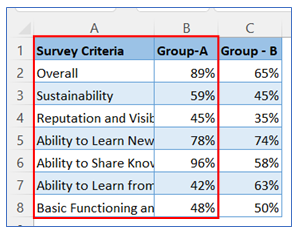
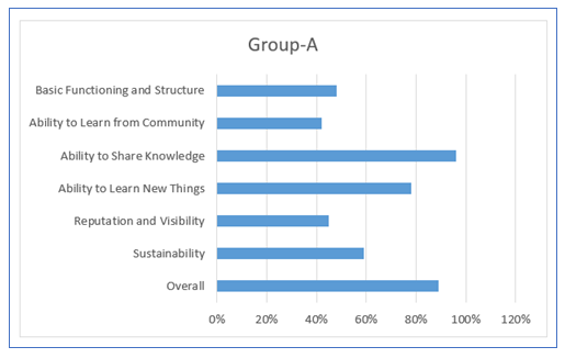
- Take sample data as below, we create first bar chart based on Col B data initially.
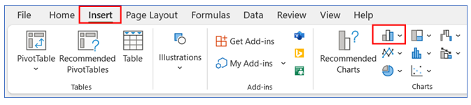
2. Select data of Col A and Col B then go to the ribbon, select Insert, and select your chart type from the chart group.
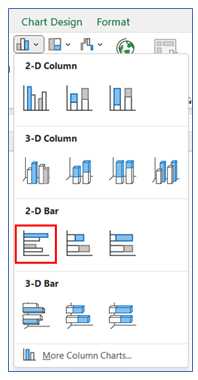
3. Select Chart type as 2-D Bar.
4. The chart looks below.
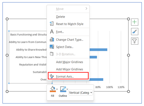
5. To change the category in reverse on the vertical axis, right-click on the axis and select Format Axis.
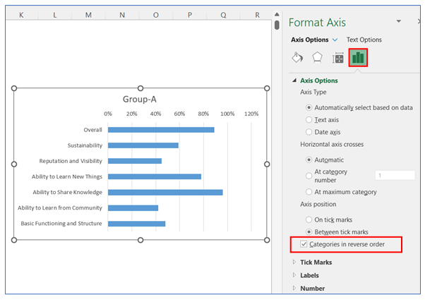
6. After that in the Axis Options give a checkmark on the ‘Categories in Reverse Order’ box.
7. To remove the horizontal axis, click on Axis and press Delete.
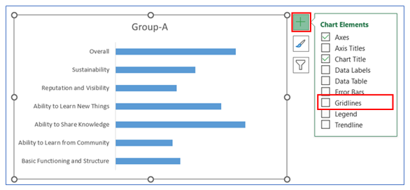
8. To Remove Gridline, click on the chart then select the + button, and uncheck the Gridline.
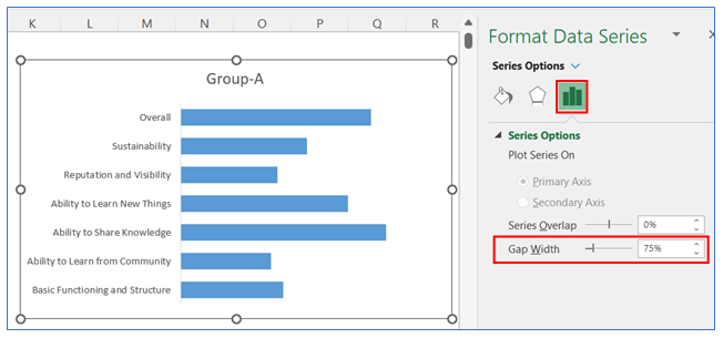
9. To change the gap width in the bar, right-click on the chart and select Format Data, in Format Data Series select Series Option and change the gap width to 75%.
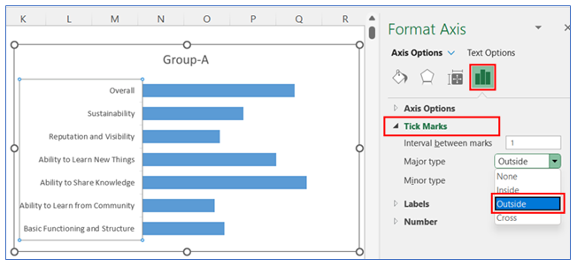
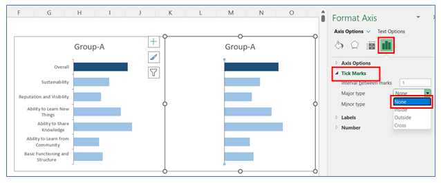
10. To give Tick Mark on the vertical Axis, right-click on the chart and select Format Axis, in Format Axis select Axis Option and click Outside in the Tick Marks option.
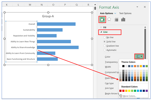
11. To change the Tick Marks line color, right-click on the vertical axis and select Format Axis, in Format Axis select Axis Option and choose a color from the Line option.
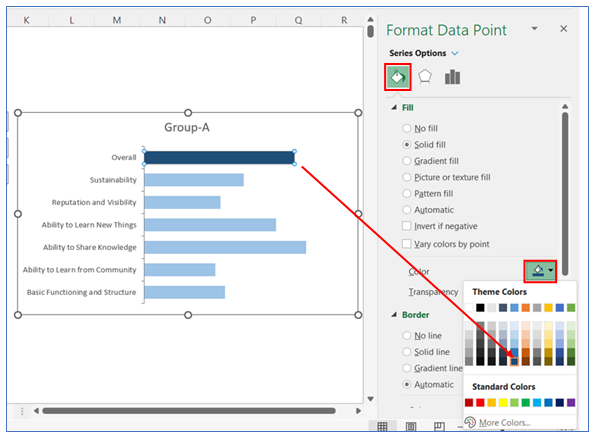
12. To change the color in the bar, right-click on the chart and select Format Data, in Format Data Series select Fill and choose your color.
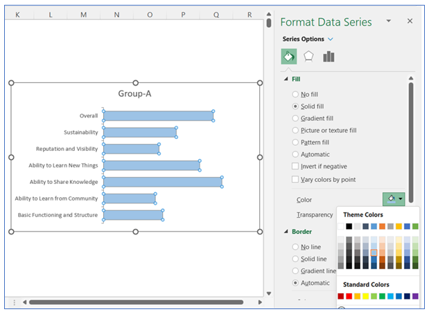
13. To change the color in the first bar, right-click on the chart and select Format Data, in Format Data Series select Fill and choose your color.
14. Make a copy of this Chart and paste beside of it, make sure both charts are in same horizontal position.
15. To remove the category of the vertical Axis from the second chart, right-click on the axis and select Format Axis, in Format Axis select Axis Option and click None in the Labels option.
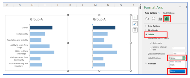
16. To give Tick Mark on the vertical Axis in the second chart, right-click on the axis and select Format Axis, in Format Axis select Axis Option and click Outside in the Tick Marks option.
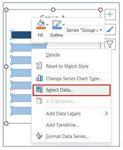
17. To change the second data series, right-click on the second chart and click Select Data.
18. To add the second Data, go to the Edit option, shown below.
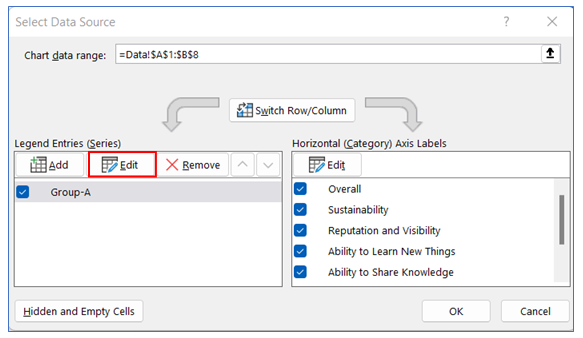
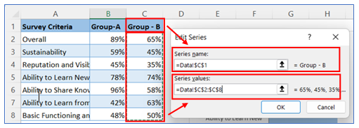
19. Select the Series name and series values from the sample data table.
20. To change the color in the second chart bar, right-click on the chart and select Format Data, in Format Data Series select Fill and choose your color.
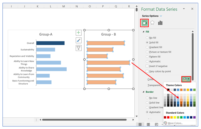
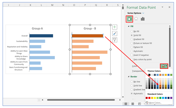
21. To change the color in the first bar in the second chart bar, right-click on the chart and select Format Data, in Format Data Series select Fill and choose your color.
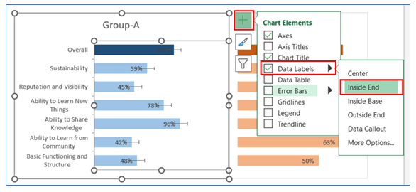
22. To give Data Labels in the first chart click on your chart and select the + button to give your Data labels. Select Data labels and click on Inside End or any other option. Do the same thing for the second chart.
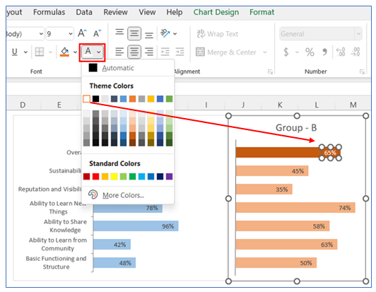
23. Change the first bar data labels colors on both charts, go to ribbon select the text color change option and choose white.
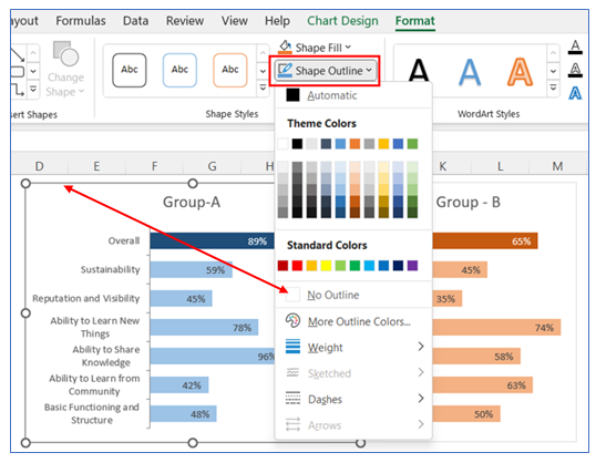
24. To remove Chart Outline, select Format in the ribbon, click Shape Outline, and choose No Outline.
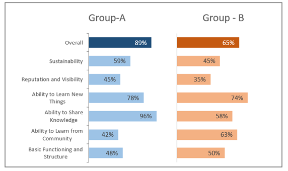
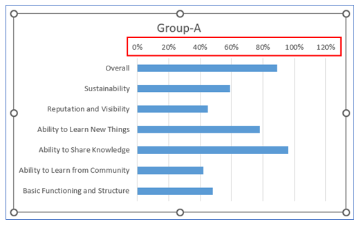
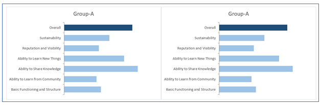
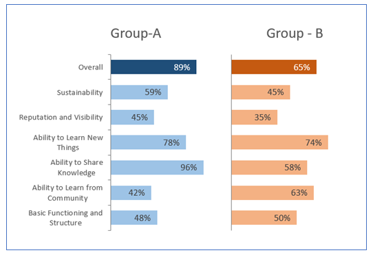
25. The chart looks below.
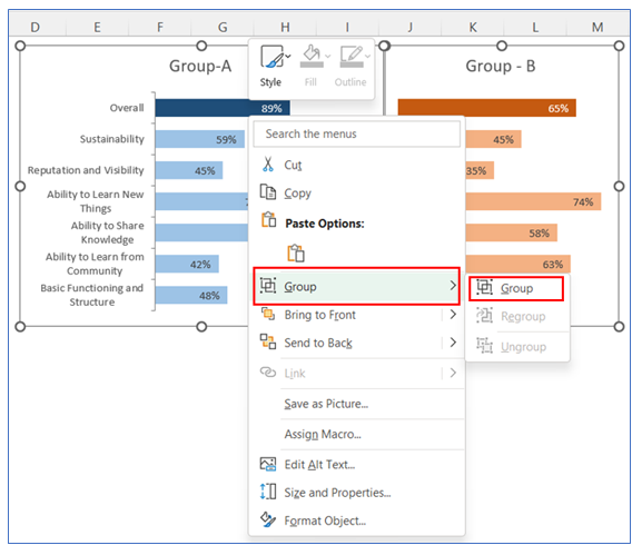
26. To make Group select two charts and right-click on the chart then select Group.
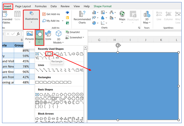
27. To give a boarder in the back of two charts, we insert a shape. Follow the below steps. Draw the shape and place in back of two charts.
28. To remove Shape fill, select Format in the ribbon, click Shape then choose No Fill.
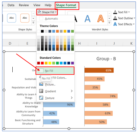
29. To give Shape Outline, select Format in the ribbon, click Shape Outline, and choose Outline color.
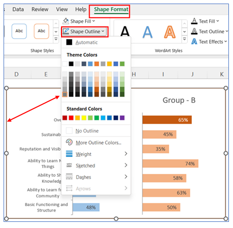
30. The Chart looks below.