Population pyramid chart in Excel is a visual storytelling tool, indispensable for demographers, marketers, and policy analysts for representing age and gender distributions. These charts provide a clear, intuitive view of demographic trends and structures, making them crucial for planning, resource allocation, and market analysis. Whether you’re assessing a product’s target demographic, planning for future workforce needs, or analyzing population growth patterns, this guide will navigate you through the process of creating a population pyramid chart in Excel. By mastering this technique, you’ll be able to present complex demographic data in a format that’s both accessible and visually compelling, allowing for deeper insights and more informed decision-making.
Uses of Population Pyramid Chart in Excel:
- Demographic Analysis: Population pyramid charts are used by demographers to visualize the age and sex distribution of a population, aiding in the study of population dynamics and trends.
- Resource Allocation: Governments and organizations use these charts for planning resource allocation, such as healthcare, education, and retirement services, based on the age structure of the population.
- Market Research: Marketers utilize population pyramids to understand the age and gender profile of a target market, tailoring products, services, and advertising strategies accordingly.
- Policy Development and Planning: Policymakers rely on population pyramids to anticipate future needs, such as workforce development and pension schemes, based on shifting age demographics.
Step-by-step guide to create a population pyramid chart in Excel:
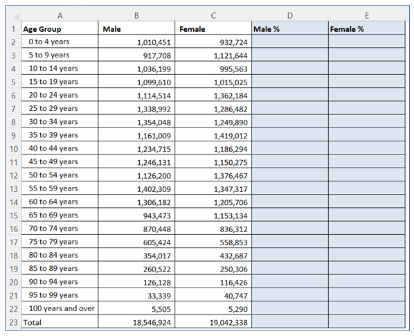
- Take sample data. Here we take 2 more columns for supporting calculation.
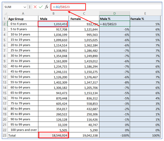
2. To create Male %, give the below formula and copy it down to the column. Use the =C2/$C$23 formula for Female %.
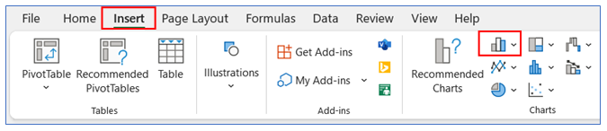
3. Select any cell of data then go to the ribbon, select Insert, and select your chart type from the chart group.
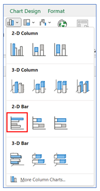
4. Select Chart type as 2-D Bar.
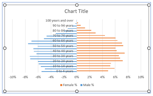
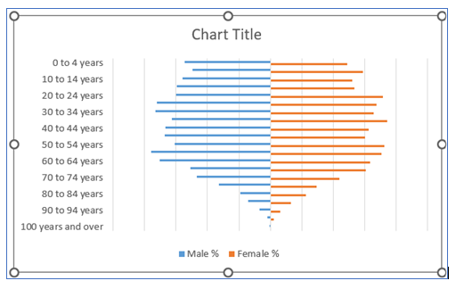
5. The chart looks below.
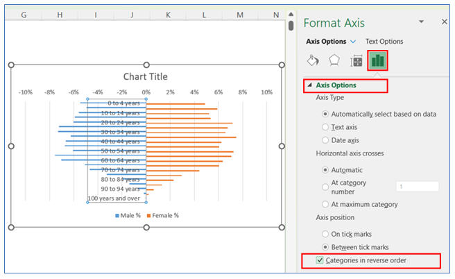
6. To change the category in reverse on the vertical axis, right-click on the axis and select Format Axis.
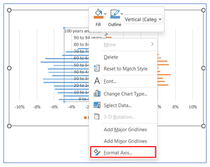
7. After that in the Axis Options give a checkmark on the ‘Categories in Reverse Order’ box.
8. To change the axis label position, right-click on the Axis and select Format Axis, in Format Axis select Axis Option and choose Labels. Here click Low in the Label Position.

9. To remove the horizontal axis, click on Axis and press Delete.
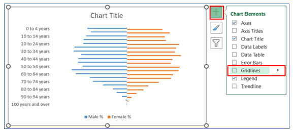
10. To Remove Gridline, click on the chart then select the + button, and uncheck the Gridline.
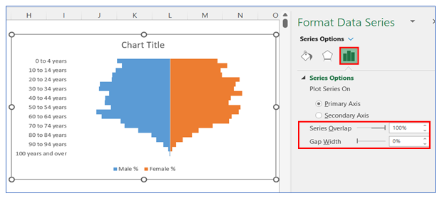
11. To change the gap width in the bar, right-click on the chart and select Format Data Series, in Format Data Series select Series Option and change the gap width to 0%.
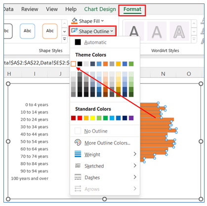
12. Now we give a white outline in the bar to distinguish one bar from another. Select the bar, go to Format ribbon, and choose shape outline as white.
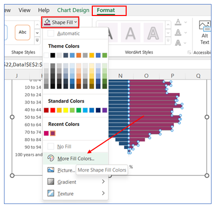
13. To change the color, select the bar, go to Format in the ribbon, click Shape Fill, and choose your color.
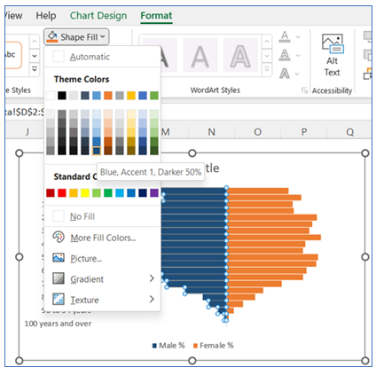
14. Follow the same step to change the color of the other part of the chart. Select the bar, go to Format in the ribbon, click Shape Fill, and choose your color.
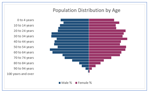
15. Select the chart Title and write your appropriate Title.
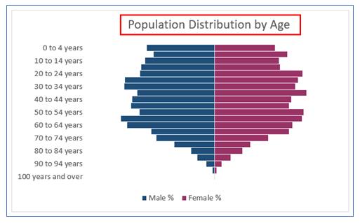
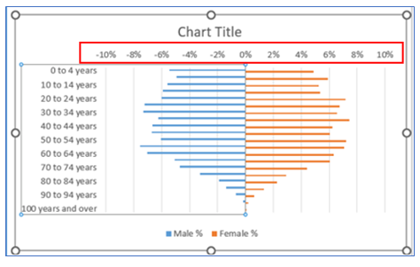
16. The chart looks below.
Things to remember to create population pyramid chart
To make a population pyramid in Excel is streamlined by focusing on these five essentials:
- Data Arrangement: Organize data into three columns: age groups, male population (negative values), and female population (positive values).
- Selecting the Right Chart Type: Choose a ‘Bar Chart’ and format it as a stacked bar chart to display male and female populations on opposite sides.
- Adjusting the Axes: Reverse the age categories on the vertical axis and ensure the horizontal axis balances negative and positive values.
- Formatting the Chart: Use contrasting colors for the bars to differentiate between male and female data.
- Adding Labels and Titles: Incorporate clear labels for age groups and populations, and add a descriptive title to the chart.
Application of population pyramid chart in Excel Dashboard reporting:
- Workforce Planning: HR departments can use population pyramid charts in Microsoft Excel dashboard templates to visualize the age distribution of employees, aiding in succession planning and identifying future workforce gaps.
- Healthcare Resource Management: Healthcare administrators can incorporate population pyramids to forecast the demand for various healthcare services, ensuring proper allocation of resources like staff and medical facilities.
- Pension Fund Analysis: Financial analysts can use population pyramid graphs to assess the age profile of pension fund members, helping in predicting future payout requirements and fund sustainability.
- Educational Program Planning: Educational institutions can analyze the age distribution of the population to plan for future educational needs, facilities, and programs.
- Urban Planning and Infrastructure Development: City planners can utilize population pyramids to understand the demographic percentage makeup of a region, facilitating the planning of housing, transportation, and public services.
- Marketing and Product Development: Marketers can integrate population pyramids into their dashboards to identify target market segments, tailoring product development and marketing strategies to meet the specific needs of different age groups.You may be interested:
