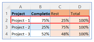
- Take sample data. Select data for Project-1 as indicated below.
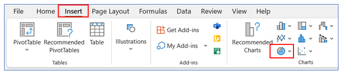
2. Go to the ribbon, select Insert, and select your chart type from the chart group.
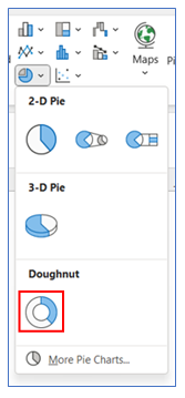
3. Select Chart type as Doughnut.
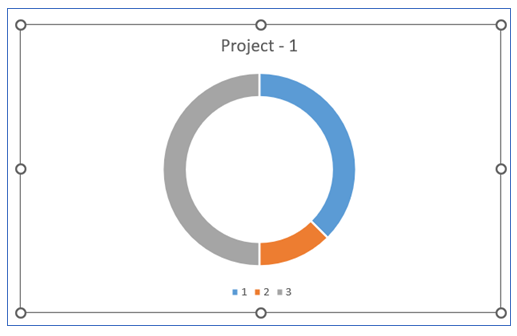
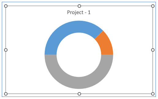
4. The chart looks below.
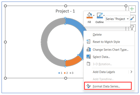
5. For changing the angle and the doughnut hole size, Right click on the chart and select Format Data Series.
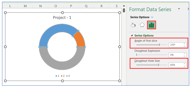
6. Change the angle size and the doughnut hole size from the Series Option.
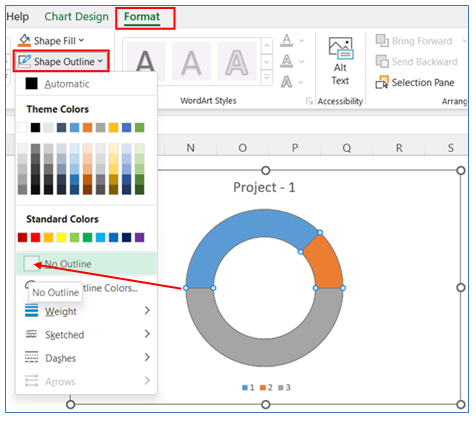
7. To remove the outline from the chart, select Format in the ribbon, click Shape Outline, and Choose No Outline.
8. To Remove the legend at the bottom, select the legend and delete it.
9. To make the full circle into a half-circle, Right click on the bottom part of the chart and select Format Data Series.
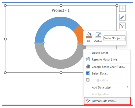
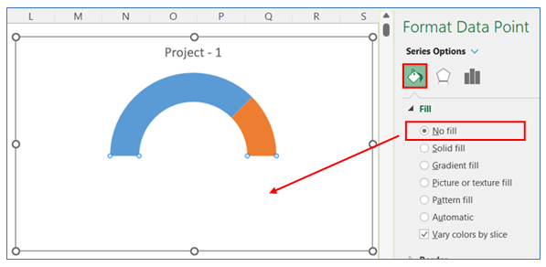
10. Then go to the Series Option, and click No Fill.
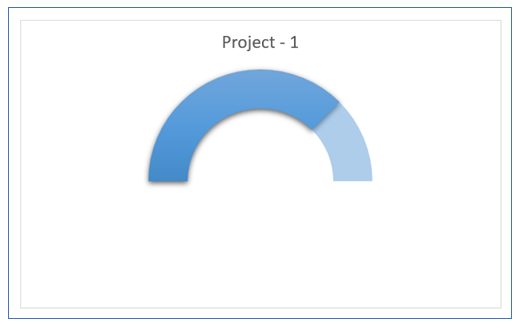
11. In the following steps we will customize the arc of the pie/circle as below:
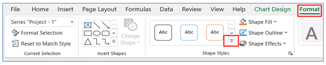
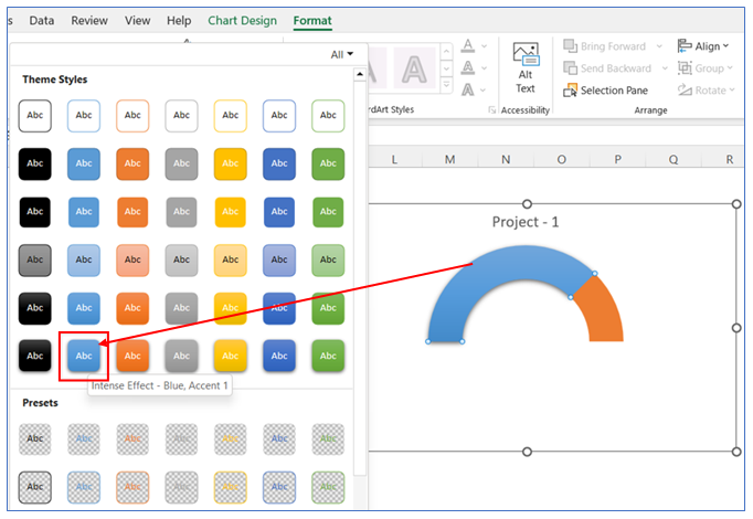
12. For changing the Theme style of the pie/arc of the circle – select the pie and – go to Format in the ribbon. Click the drop-down arrow in the Shape Styles Group.
13. Choose the theme color of the First part of the chart.
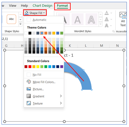
14. To change color in the second part of the chart, select Format in the ribbon, click Shape Fill and choose a color.
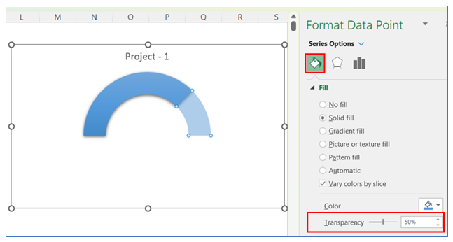
15. To change color transparency in the second part of the chart, right-click on the chart to go to Format Data Series Select Series Option, and change the transparency level.
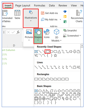
16. To show Data Label in the middle of the circle, we need to insert a rectangular share. Select Insert in ribbon, click Shape from Illustrations, and Choose a shape.
17. Select the shape and link the data cell in the formula bar. Format the shape as no outline and drag it to the center of the chart.
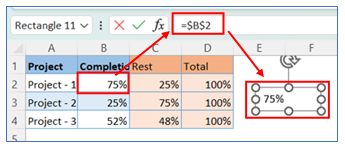
18. The chart looks below.

