Introduction to Profit Margin Dashboards in Power BI
Overview of Profit Margin Analysis Using Power BI
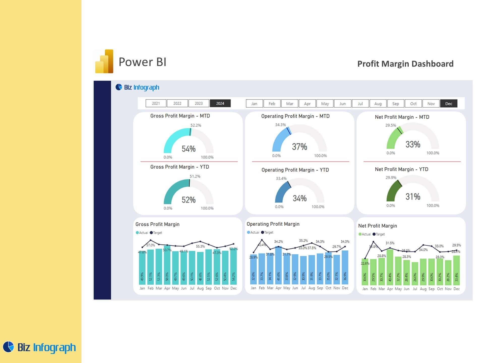
A profit margin analysis dashboard in Power BI offers businesses a powerful way to evaluate their financial health by tracking gross profit percentage, net margin, and other key metrics. Using Microsoft Power BI, companies can consolidate financial data from multiple sources into a single platform for efficient analysis using Power BI. These dashboards help finance teams analyze total sales and total costs, monitor changes in performance over time, and ensure financial sustainability. Power BI dashboards for finance provide actionable insights that simplify decision-making and help businesses stay competitive in a fast-paced environment.
Benefits of Using Power BI Dashboards for Financial Management
Power BI dashboards for finance transform raw data into actionable insights with advanced visualization tools. By using a dashboard template, businesses can track key performance metrics like gross profit to total revenue and operating expenses from gross profit. Power BI’s flexibility allows for real-time updates, enabling organizations to respond quickly to trends and challenges. Dashboards also facilitate collaboration within the finance team, ensuring that decisions are based on accurate, up-to-date information.
Key Metrics and Features in a Profit Margin Dashboard
Essential Metrics for Profit Margin Analysis
A profit margin dashboard focuses on critical metrics such as gross profit, net margin, and cost of goods sold (COGS). These metrics provide insights into a company’s financial performance by analyzing the relationship between revenue and costs. By deducting expenses like COGS and overheads from revenue, businesses can calculate their margins and assess their profitability. Power BI dashboards make it easy to visualize these metrics, helping teams track trends and changes in performance.
Tracking Key Performance Indicators (KPIs) for Financial Health
Key performance indicators (KPIs) like revenue growth, profit margin, and customer lifetime value are central to a well-designed KPI dashboard. Power BI’s interactive dashboards allow users to drill down into detailed performance data, such as sales by product or region. This enables businesses to identify opportunities for improvement and optimize their operations. A dashboard is designed to provide a clear picture of financial health, ensuring that decision-makers have access to the insights they need.
Visualizing Margins and Trends in Power BI Dashboards
Power BI dashboards offer advanced visualization tools like heat maps and bar charts to present trends and changes in performance over time. For example, a sales performance dashboard can display monthly revenue alongside corresponding profit margins, while heat maps showcasing regional sales distribution highlight high-performing areas. These visualizations enable teams to quickly understand complex data and make informed decisions.
Building a Profit Margin Dashboard in Power BI
Steps to Build a Power BI Dashboard for Profit Margins
Building a dashboard in Power BI begins with integrating financial data sources into Power Query Editor. Users can then create data models using Power Pivot to calculate metrics like total profits by total sales or gross profit percentage. By adding visuals such as graphs and charts, businesses can create a dashboard that allows them to monitor financial metrics effectively. Power BI offers templates and tools to streamline this process, ensuring that dashboards are both functional and visually appealing.
Using Power BI Templates for Margin Analysis Dashboards
Dashboard templates in Power BI simplify the creation of financial dashboards by providing pre-built layouts and metrics. These templates are customizable, allowing businesses to tailor their dashboards to focus on specific needs, such as profit and loss or sales performance dashboard data. A dashboard created using these templates reduces setup time and ensures consistency across financial reporting efforts.
Integrating Data Models for Comprehensive Profit Analysis
A profit margin analysis dashboard relies on robust data models to connect and analyze financial information. By integrating dashboard data from sales, accounting, and operational systems, businesses can generate a comprehensive view of their profitability. This integration enables dynamic reporting and ensures that the dashboard tracks metrics like revenue, expenses, and profit margins in real-time.
Enhancing Profit Margin Analysis with Power BI
Leveraging DAX for Advanced Data Analysis
Using Power BI and DAX, businesses can perform advanced calculations and create custom metrics for deeper insights into their financial performance. For example, DAX functions can calculate monthly profit margins, project future profitability, or assess the impact of operating expenses from gross profit. This level of analysis enhances decision-making and supports strategic planning.
Analyzing Profit and Loss Statements in Power BI
A profit margin dashboard integrates profit and loss data to provide a clear view of an organization’s financial position. By visualizing revenue, expenses, and profit margins side by side, businesses can identify areas for improvement and align their operations with financial goals. Power BI dashboards for finance make this analysis accessible through intuitive charts and tables.
Real-Time Insights into Margins with Interactive Dashboards
Power BI’s interactive dashboards enable users to view real-time data, ensuring that profit margin analysis is always current. This is particularly valuable for monitoring changes in performance over time and responding to market trends. Dashboards also support drill-down capabilities, allowing teams to explore detailed metrics, such as customer profitability or product-specific margins.
Best Practices for Profit Margin Dashboards in Power BI
Designing Dashboards for Effective Financial Visualization
A well-designed dashboard prioritizes clarity and usability. This includes organizing metrics into logical sections, using consistent color schemes, and incorporating filters for dynamic analysis. Dashboard provides decision-makers with a clear understanding of their financial health, enabling them to act quickly and confidently.
Customizing Dashboards to Align with Business Goals
Customizing a profit margin dashboard ensures that it aligns with the organization’s strategic objectives. For instance, a company focused on reducing costs might emphasize cost of goods sold, while a business aiming to boost revenue could prioritize gross profit to total revenue. Tailoring dashboards to these needs helps businesses stay focused on their goals.
Ensuring Data Accuracy and Consistency in Financial Reporting
Accurate and consistent data is essential for effective decision-making. Power BI dashboards integrate data from multiple sources and automate updates, reducing the risk of errors. This ensures that the dashboard offers reliable insights for tracking financial performance and planning future strategies.
Examples and Applications of Profit Margin Dashboards in Power BI
Examples of Power BI Dashboards for Profit Margin Analysis
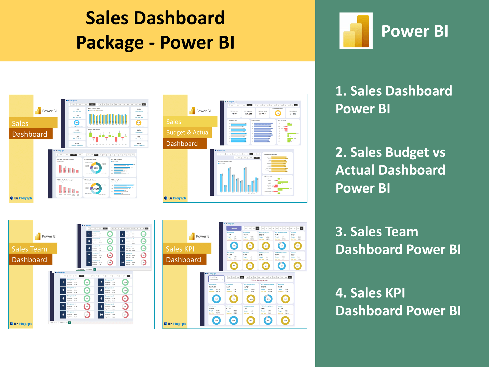
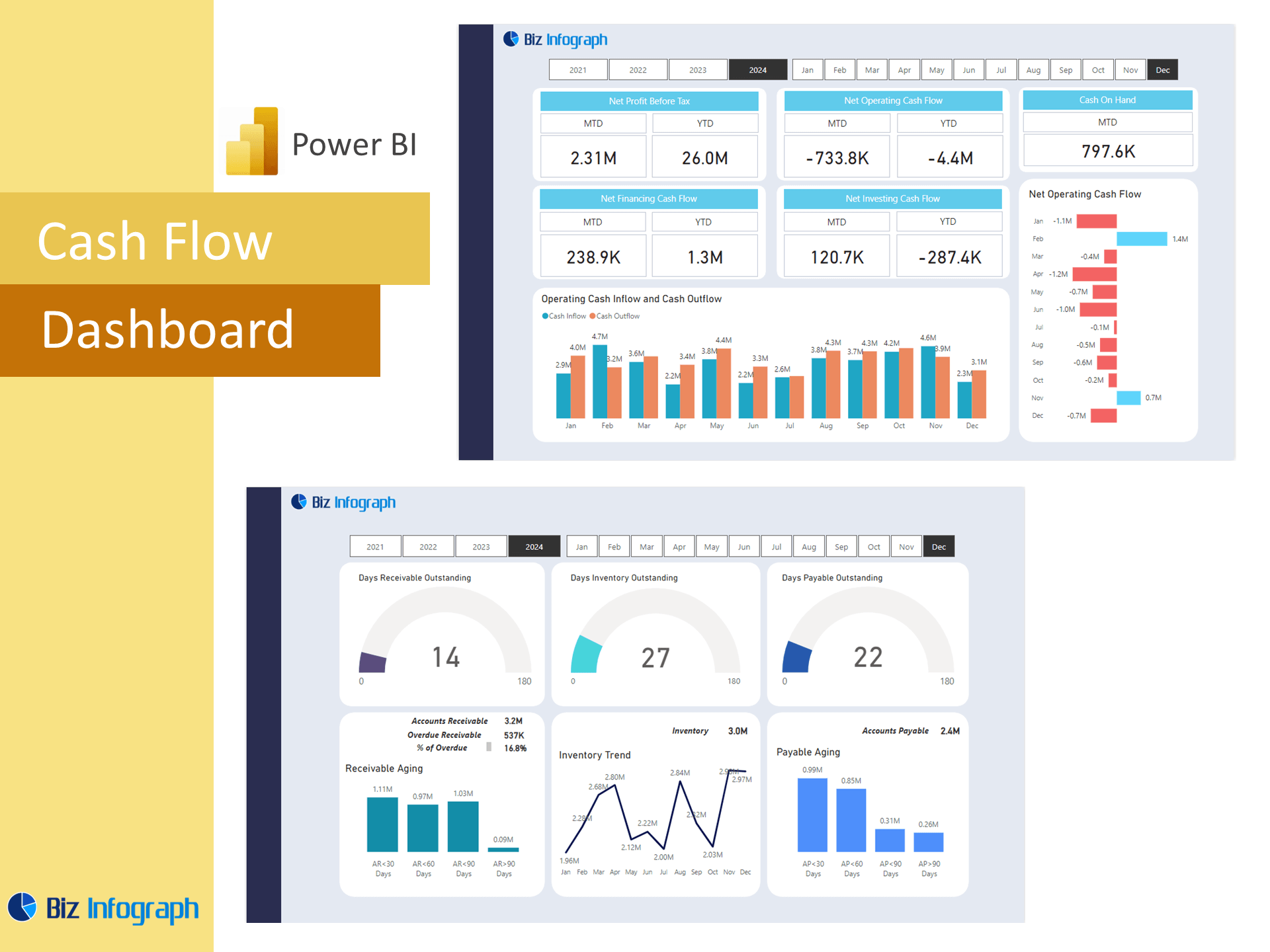
Examples of Power BI dashboards for profit margin analysis include revenue dashboards, expense tracking dashboards, and customer profitability dashboards. These dashboards highlight how Power BI offers businesses the flexibility to focus on the metrics that matter most.
Use Cases of Profit Margin Dashboards in Business Management
Profit margin dashboards are widely used across industries for budgeting, forecasting, and performance monitoring. For example, a retail business might use a sales performance dashboard to assess profitability by product category, while a manufacturing company could analyze margins by region. These use cases demonstrate the versatility of Power BI dashboards.
How Power BI Dashboards Drive Financial Decision-Making
By providing actionable insights, Power BI dashboards empower organizations to make informed financial decisions. Dashboards help businesses monitor profitability, adjust strategies in response to trends, and align operations with long-term goals. The ability to dashboard visually track key metrics ensures that decision-making is both efficient and data-driven.
Power BI Dashboards for Profit Margin Management
Transforming Financial Analysis with Power BI Dashboards
Power BI dashboards for finance transform financial analysis by offering advanced visualization tools, real-time updates, and customizable templates. These features enable businesses to track profitability and make data-driven decisions with confidence.
Future Trends in Power BI for Profit Margin Optimization
As Power BI’s capabilities evolve, future dashboards will incorporate predictive analytics and machine learning to enhance margin optimization. These advancements will enable organizations to anticipate changes, identify opportunities for growth, and maintain a competitive edge. Using Power BI report, businesses can ensure their financial health and long-term success.
You may be interested:


