Introduction to Sales Dashboards in Power BI
What is a Power BI Sales Dashboard?
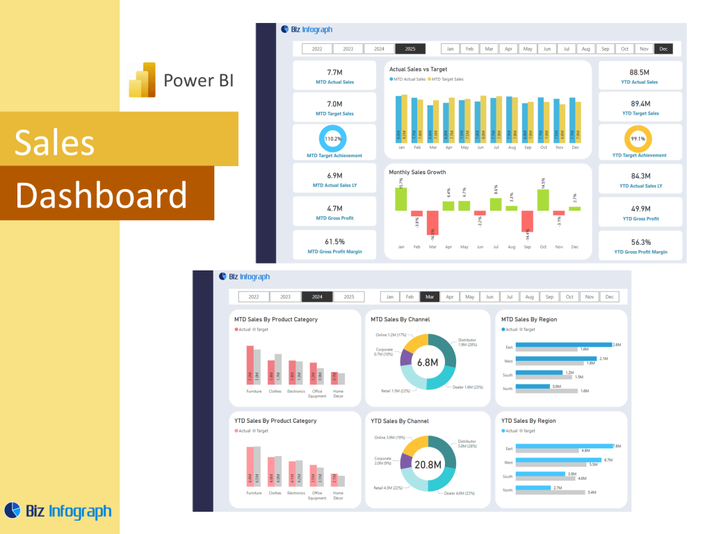
A sales dashboard in Power BI template is a dynamic, interactive tool that displays sales data in visual formats such as graphs, charts, and KPIs. Built using Microsoft Power BI, this dashboard is designed to provide sales professionals and executives with a real-time view of performance across various metrics. The dashboard may include visuals for sales by region, sales by product, and sales vs. targets, giving a comprehensive understanding of business performance. As a BI tool, Power BI makes it easy to create a dashboard that tracks progress, identifies gaps, and monitors sales at every stage of the pipeline.
Benefits of Using Power BI for Sales Analysis
Power BI is a powerful platform for sales analytics, helping organizations analyze sales data and derive actionable insights. A sales dashboard helps businesses meet sales targets by tracking performance in real time and highlighting areas for improvement. With features like drill-through reports, slicers, and dashboard highlights, users can explore trends by product, time period, or territory. Power BI provides flexibility through dashboard templates, making it easier to build custom dashboards tailored to specific business needs. Whether used by sales reps, executives, data analysis, or analysts, a Power BI dashboard fosters better alignment and smarter decision-making across sales functions.
Overview of Key Dashboard Features and Visualizations
The typical overview Sales dashboard in Power BI contains essential dashboard features such as total revenue, monthly sales, top-performing products, and pipeline status. These dashboards and reports are highly visual, making it easy to communicate key information at a glance. Visualizations might include bar charts for product sales, maps for total sales by region, and gauges to track progress toward future sales goals. Power BI supports custom design using the Power Query Editor to transform raw data into meaningful reports. The interactive Power BI dashboards ensure that users can explore different dimensions of sales performance effortlessly.
Core Components of a Sales Analysis Dashboard
Essential Sales Performance Metrics
Every sales dashboard should track sales metrics that reflect business health. Common indicators include revenue, average deal size, conversion rate, customer acquisition cost, and churn rate. These metrics help sales managers assess whether their teams are on track to hit overall sales goals. A well-designed management dashboard may also incorporate win/loss ratios and sales cycle length to provide deeper context. By leveraging Power BI dashboard templates, businesses can present these figures clearly and dynamically. Power BI allows users to use power BI dashboards that not only report but also forecast based on trends—essential for proactive sales planning.
Integrating Sales Analytics for Deeper Insights
Sales analytics is about more than just numbers—it’s about understanding behavior and performance. Power BI enables organizations to combine historical data with real-time feeds to identify what’s driving sales success. By analyzing sales by product, team performance, and customer segments, users can uncover sales patterns and optimize strategies. Tools like the Power Query Editor make it easy to join and clean datasets, which is critical when working with data from CRM systems, spreadsheets, and ERP platforms. Power BI’s ability to support complex calculations and predictive modeling makes it a top choice for sales analysis dashboards.
Building a Complete Sales Management Dashboard
A sales management dashboard is used by executives and team leaders to oversee all aspects of the sales cycle. This dashboard provides an overview of sales pipeline, team targets, territory coverage, and performance benchmarks. It enables better team alignment by offering visibility into individual rep contributions and regional performance. Templates for Power BI allow businesses to get started quickly, while customization ensures the dashboard reflects specific KPIs. Unlike static reports, Power BI dashboards update automatically and can be shared across departments using Power BI service or Power BI Report Server, ensuring all stakeholders stay informed.
Creating a Sales Dashboard in Power BI
How to Create Power BI Reports for Sales Tracking
To create Power BI dashboards for sales, begin by gathering raw data from your CRM, spreadsheets, or data warehouse. Then, use the Power Query Editor to transform and clean the data—ensuring consistency and removing duplicates. After preparing your dataset, move to the Power BI Report canvas to begin building visuals. Start with essential metrics, add slicers for interactivity, and use KPIs for targets and comparisons. Power BI templates can speed up the process, especially for standard sales reporting. Once built, publish your report to Power BI service for team-wide access and real-time collaboration.
Using Power BI Templates and Data Sources
Power BI dashboard templates are pre-designed frameworks that simplify the dashboard creation process. These templates often include visuals for sales trends, funnel conversion, and product sales breakdowns. Whether you’re starting with a free Power BI template or a premium design, templates help structure your dashboard quickly. Power BI supports importing from various data sources including Excel, SQL, and cloud platforms. You can also integrate marketing performance data to create a blended sales and marketing view—ideal for campaigns. Templates are essential for those new to Power BI or for teams looking to standardize reporting across business units.
Best Practices for Sales Dashboard Design
When building a sales analysis dashboard, focus on clarity, consistency, and actionability. Use intuitive layouts, group similar metrics, and avoid overcrowding the dashboard with too many visuals. Highlight key figures such as monthly sales, top products, and targets. Incorporate filtering tools to allow users to drill down into specific time periods or regions. Leverage interactive Power BI visuals to create dynamic reports that adjust to user input. Align dashboard views with user roles—sales managers need broader summaries, while sales reps may prefer detailed activity tracking. Test your dashboard frequently to ensure performance and usability across devices.
Sales Dashboard Examples and Use Cases
Top Power BI Dashboard Examples for Sales Teams
Some of the top Power BI dashboard examples for sales include territory performance dashboards, sales vs. targets dashboards, and product mix reports. These examples of Power BI dashboards help visualize team activity, identify high-converting channels, and optimize resource allocation. A well-designed dashboard can help pinpoint inefficiencies in the funnel and spotlight overachievers. Companies can use dashboards to set clear goals, track conversion paths, and forecast future performance. With built-in visuals and easy sharing, Power BI remains one of the most powerful BI tools available for sales teams aiming to scale performance and drive revenue.
Sales Analysis Dashboards vs. Financial Analysis Dashboards
While sales analysis dashboards focus on revenue generation, customer segmentation, and pipeline tracking, financial analysis dashboards emphasize profit margins, expenses, and overall financial health. Both dashboard types are often integrated for a holistic view of company performance. Sales dashboards highlight sales trends and team activity, while finance dashboards dive into cash flow and budgeting. Using Power BI finance tools, companies can bridge the gap between what’s sold and what’s earned. This integrated approach ensures departments work cohesively to drive both top-line and bottom-line growth.
Comparing Sales Dashboards with HR and Marketing Dashboards
Sales dashboards serve different goals than HR analytics dashboards or marketing campaign dashboards. Where HR dashboards track recruitment, retention, and compliance, sales dashboards are centered around performance and pipeline. Similarly, a Google Ads dashboard or ads dashboard template might track campaign clicks and spend, while a sales dashboard will show how those leads convert to revenue. By aligning sales and marketing data, companies can evaluate campaign ROI more effectively. This holistic view is key in strategy meetings and management dashboard reviews, where cross-department synergy is vital.
Advanced Features and Customization in Power BI
Power BI Service Integration for Real-Time Reporting
Power BI service allows for cloud-based sharing, enabling users to view dashboards on any device with internet access. This enhances team collaboration and ensures everyone sees the latest numbers. Power BI supports scheduled refreshes and email subscriptions, making reporting seamless and consistent. Interactive Power BI dashboards shared through the service help sales managers react quickly to shifting market conditions and team performance issues. Whether managing a remote team or a large enterprise, Power BI Report Server or the cloud service ensures your dashboard provides an overview that is both timely and accessible.
Using Templates for Power BI to Speed Up Development
Starting with a Power BI template saves valuable time and ensures a structured layout. Many templates for Power BI are available for free, offering pre-set visuals, themes, and placeholders for custom data. These templates cover everything from sales analytics to finance dashboards, and can be easily modified to reflect brand colors and company-specific KPIs. Templates also help maintain consistency across departments and dashboards, making it easier to train new users and standardize performance tracking. Teams can even create a power bi internal libraries of custom dashboard templates for repeat use.
Enhancing Your Insights Dashboard with Marketing and Ads Data
Combining sales and marketing data can turn your dashboard into a powerful insights dashboard. By integrating data from a Google Ads dashboard or marketing campaign dashboard, sales teams can identify which campaigns are generating high-value leads. This fusion of data enables sales and marketing teams to align their efforts and prioritize channels that offer the best return. Using Power BI’s data modeling capabilities, you can link campaigns to sales outcomes, transforming your dashboard into actionable intelligence that drives revenue and improves budget efficiency.
For ready-to-use Dashboard Templates: