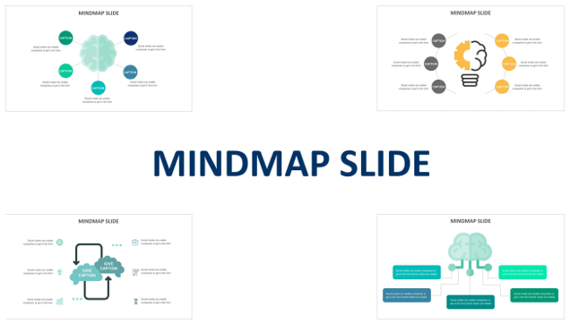
Visual-data-representation
Mindmap slide cover
In a world filled with information overload, sharing your message effectively is no small feat. Whether you’re in a boardroom presenting to stakeholders, in a classroom conveying knowledge, or in a conference room pitching your innovative idea, your presentation’s design can either elevate your message or leave it lost in the noise.
This is where the power of professional presentation templates comes into play. They are more than just pre-designed slides; they are tools that can revolutionize the way you convey information, making your slides engaging, impactful, and visually stunning.
In this blog, we’ll explore the science of visual communication, dive into the world of professionally designed presentation templates, and reveal the secrets of creating presentations that not only captivate your audience but also leave a lasting impression.
What Are Professional Presentation Templates?
Professional presentation templates are more than just visually appealing slide layouts. They are comprehensive tools that encapsulate effective design principles, ensuring your slides are not only aesthetically pleasing but also optimized for communication.
These templates offer carefully curated designs for title slides, content slides, charts, graphs, infographics, and more. They come with a palette of harmonious colors, thoughtfully selected fonts, and placeholders for your content. In essence, they are your canvas, waiting for your ideas to transform them into impactful presentations.
Benefits of Using Professional Presentation Templates
The advantages of using professional presentation templates are manifold, and they extend beyond aesthetics. Here are some key benefits:
Consistency and Branding:
Templates provide a consistent look and feel to your presentations, ensuring that your brand identity is maintained across all your slides. This consistency fosters brand recognition and professionalism.
Visually Stunning Graphics and Layouts:
Professionally designed templates offer visually striking elements, from elegant typography to captivating imagery. These design elements grab your audience’s attention and make your content memorable.
Time-Saving Efficiency:
Templates streamline the design process. You don’t have to start from scratch; instead, you build upon a well-structured foundation. This not only saves time but also ensures that your slides are organized and visually coherent.
Now that we’ve laid the groundwork, let’s delve deeper into the features of professional presentation templates and discover how they can transform your presentations into captivating visual experiences.
Choosing the Right Presentation Template
Not all presentation templates are created equal. To harness the full potential of professional presentation templates, you need to select the right one for your specific needs. Here’s how to make the perfect choice:
Matching Templates to Your Message
Before diving into the world of templates, it’s crucial to understand your presentation’s message, audience, and objectives. Here’s how to align your template choice with your content:
Identify Your Presentation’s Purpose:
Are you delivering a sales pitch, an educational lecture, or a project update? Each of these demands a different tone and style. Clarify your presentation’s purpose and message before selecting a template.
Know Your Audience:
Consider your audience’s preferences and expectations. Are they looking for a formal, corporate presentation, or do they appreciate a more creative, visually stimulating approach? Matching the template to your audience’s sensibilities is key.
Highlight Your Content Structure:
Your template should complement your content structure. If you have a lot of data to present, consider a template with robust chart and graph layouts. For storytelling presentations, opt for templates with elegant content flow.

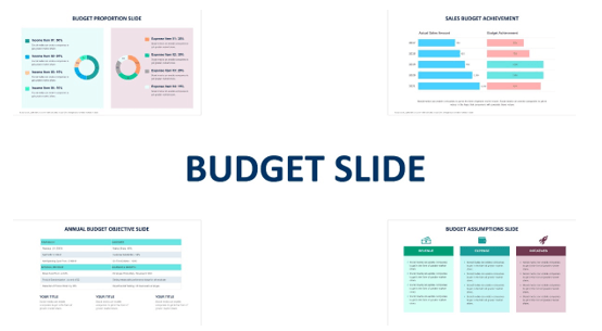
Budget-excel-sheets
Customization Options and Flexibility
While templates provide a starting point, they should also allow room for customization to make your presentation unique. Here’s what to look for in terms of flexibility:
Editable Elements:
Check whether the template offers editable elements, such as text boxes, image placeholders, and graphic elements.
Color Schemes and Branding:
Templates should enable you to change color schemes to match your branding or align with the visual style you want for your presentation. Consistency in branding is essential for brand recognition.
Typography and Fonts:
Ensure that you can adjust fonts and typography to maintain consistency with your organization’s guidelines or to suit the presentation’s tone.
Consider Template Compatibility and Ease of Use
Practicality is essential when choosing a presentation template. Here are some practical considerations:
Compatibility Across Platforms:
Check if the template is compatible with the presentation software you plan to use. The best templates are often available for PowerPoint, Google Slides, and Keynote, ensuring that you can work seamlessly across different platforms.
User-Friendly Interface:
A user-friendly template should be easy to navigate and customize. Consider templates with intuitive interfaces that make editing and modifying slides a breeze.
Support and Updates:
Verify whether the template provider offers support and updates. In case you encounter issues or need enhancements, you can receive customer support.
Trial and Testing
Finally, it’s a good practice to test your selected template with a few sample slides before committing to it fully. This trial phase allows you to ensure that the template aligns with your content and presentation goals.
By matching the right template to your message, considering customization options and compatibility, and conducting a trial run, you can confidently select a presentation template that transforms your content into a compelling visual story.
6. The Art of Storytelling Through Slides
Great presentations are not just about delivering information; they’re about telling a compelling story. Professional presentation templates can significantly enhance your storytelling abilities. Here’s how:
Structuring Your Presentation for Impact
Beginning, Middle, End:
A well-structured presentation typically has a beginning, middle, and end. Your template should accommodate this structure seamlessly. Look for templates with clear sections for introductions, content development, and conclusions.
Narrative Flow:
Consider how your template guides the flow of your story. Does it include options for transitions between sections or slides? Transition effects can help connect your narrative and maintain your audience’s engagement.
Using Templates to Enhance Your Narrative
Visual Metaphors:
Some templates incorporate metaphorical visuals that resonate with your narrative, whether it’s growth represented by a tree or transformation symbolized by a caterpillar becoming a butterfly.
Timeline Templates:
For presentations involving historical data, project progress, or process development, timeline templates can help you chronologically structure your story, making it easier for your audience to follow.

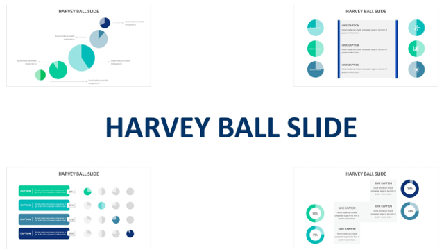
Data-visualization
7. Visualizing Data with Professional Presentation Templates
Data is often a crucial component of presentations, but it can be challenging to convey effectively. Here’s how professional presentation templates can help you visualize data:
Turning Complex Data into Understandable Visuals
Chart and Graph Layouts:
Many templates include pre-designed chart and graph layouts. These not only save you time but also ensure that your data is presented in a visually appealing and comprehensible manner.
Infographics Made Easy:
Infographics are excellent for simplifying complex data. Templates often come with infographic elements, making it straightforward to transform data points into engaging visuals.
Customizable Dashboards:
For presentations involving multiple data sets or real-time data updates, consider templates with customizable dashboard slides. These allow you to create dynamic presentations that showcase changing data over time.
Charts and Graphs That Tell a Story
Explaining Key Insights:
The best templates offer features that enable you to add annotations and descriptions to your charts and graphs. This allows you to highlight key insights and ensure your audience grasps the significance of the data.
Data Trends and Patterns:
Templates can include various chart types, from bar graphs to pie charts. This variety allows you to select the most appropriate chart type to effectively convey the specific data trends and patterns you want to emphasize.
By understanding the art of storytelling through slides and the power of visualizing data with professional presentation templates, you can elevate your presentations to a level that engages, informs, and resonates with your audience.
9. Design Tips for Maximizing Template Potential
While professional presentation templates provide a strong foundation for your slides, your creative input can make all the difference. Here are some design tips to maximize the potential of your chosen template:
Balancing Visuals and Content
Clarity is Key:
Visuals should enhance your message, not obscure it. Ensure that graphics, images, and backgrounds do not overwhelm your content. Keep text concise and use visuals strategically to support your points.
Consistency Matters:
Maintain consistency in fonts, colors, and design elements throughout your presentation. This ensures a cohesive and polished look that reflects professionalism.
Font and Color Choices
Font Selection:
Choose fonts wisely to match your presentation’s tone. Sans-serif fonts like Arial and Calibri are often recommended for on-screen presentations due to their readability.
Color Psychology:
Be mindful of color choices. Different colors evoke various emotions and convey different messages. For example, blue signifies trust and reliability, while red can denote urgency or excitement. Align your color palette with your presentation’s purpose.
Contrast:
Use contrast to draw attention to key elements. Ensure that text and graphics stand out clearly.
Avoiding Common Design Pitfalls
Overcrowding Slides:
Resist the urge to pack too much information onto a single slide. Overcrowded slides can overwhelm your audience and dilute your message.
Excessive Animations:
While animations can be engaging, use them judiciously. Overuse of animations can distract from your content. Focus on subtle transitions that enhance your narrative.
Neglecting White Space:
Embrace white space in your design. It provides visual breathing room, making your content more digestible. Don’t be afraid to leave areas of your slide blank.

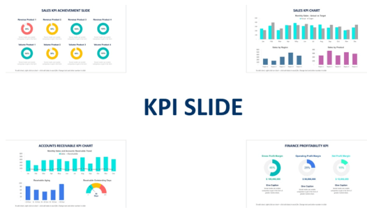
Performance-indicators
Elevate Your Presentations with Biz Infograph
Professional presentation templates are powerful tools that can transform your presentations into captivating visual experiences. By matching templates to your message, considering customization options, and adhering to design best practices, you can create presentations that engage, inform, and leave a lasting impression.
Ready to revolutionize your presentations? Explore Biz Infograph’s collection of professionally designed presentation templates. Whether you’re a business professional, educator, or speaker, our templates can help you convey your message with impact. Start impressing your audience today.