Introduction to Financial Dashboards in Excel
Overview of Financial Dashboards
A financial dashboard in Microsoft Excel is a visual tool that provides an at-a-glance view of your company’s financial performance. These dashboards consolidate key financial metrics, such as revenue, expenses, net profit, and cash flow, in one location for easy monitoring and analysis. Dashboards are essential for decision-makers who need quick access to critical financial data. Financial dashboards in Excel are highly customizable and can integrate various data sources, enabling users to track multiple KPIs (Key Performance Indicators) and metrics specific to their business needs. Dashboards created in Excel can also be automated to reflect real-time updates, providing actionable insights.
Importance of Financial Dashboards for Data Visualization and Financial Analysis
Financial dashboards play a pivotal role in financial analysis by helping companies visualize their financial data through charts and graphs. These dashboards provide data-driven insights into a company’s financial health, highlighting trends and enabling deeper analysis of key metrics such as gross profit, net profit, and sales performance. With data visualization, complex financial data becomes easier to interpret, leading to faster and more informed decisions. Dashboards can be used to monitor various financial aspects, such as budget vs. actual performance, cost of goods sold, and cash flow, allowing users to assess the company’s overall performance quickly.
Key Elements of a Financial Dashboard in Excel
Identifying Key Metrics for Your Financial Dashboard
The first step in dashboard creation is identifying the key financial metrics that are critical to your business. Metrics like revenue, gross profit, net profit, cash flow, and operating expenses should be tracked to measure the company’s financial performance effectively. Depending on your industry, you may also include specific metrics like cost per unit or sales figures. By focusing on these essential metrics, your financial dashboard provides a clear picture of the company’s financial health. For sales teams, including metrics from a sales dashboard or sales management dashboard helps track sales performance and gross margins.
Selecting Relevant Financial KPIs (Key Performance Indicators)
To make your financial dashboard actionable, it’s crucial to include relevant KPIs. KPIs such as gross profit margin, return on investment (ROI), and current ratio are essential for evaluating the financial health of a company. These financial KPIs provide benchmarks to measure performance over time and make data-driven decisions. For example, tracking income statement KPIs like revenue and net profit allows you to see at a glance how well the business is doing. Using a KPI dashboard in Excel can help streamline the process and ensure you’re focusing on the most important financial metrics.
Data Points Needed for Financial Analysis
Accurate and comprehensive raw data is the backbone of any financial dashboard. This data can include financial records from Excel spreadsheets, such as income statements, balance sheets, and sales data. Essential data points for a financial dashboard include revenues, costs, profits, cash flow, and sales figures. By aggregating this data, you can visualize trends and monitor the company’s financial status. It’s also important to integrate financial modeling techniques to predict future performance based on historical data. Gathering these data points and organizing them properly within your dashboard template in Excel ensures you’ll gain meaningful insights.
Steps to Create a Simple Financial Dashboard in Excel
Setting Up Your Excel Dashboard Template
To begin creating a financial dashboard, start by setting up an Simple Excel dashboard template. Free Excel templates can be downloaded to provide a starting point, or you can design one from scratch. Create separate sheets for data entry and charts to maintain clarity. The dashboard design should focus on simplicity and ease of use, making sure that all key metrics are easily accessible. In the setup phase, ensure that you organize your raw data and calculate relevant metrics. You can automate the dashboard using Excel power tools like formulas and power query to make the data updates seamless.
Using Excel Tools for Data Visualization (Charts, Graphs)
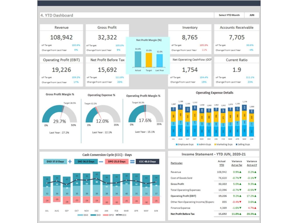
A key aspect of a financial dashboard is data visualization. In Excel, you can create dynamic charts and graphs to display financial metrics such as revenue, profit, and cash flow. We’ve created modern charts that can show financial trends over time and allow users to compare budget vs. actual performance. Excel’s chart options—such as line charts, bar charts, and pie charts—help simplify complex data. Additionally, using conditional formatting can highlight significant trends, such as revenue spikes or cost overruns, making it easier to monitor performance visually. Proper data visualization helps users gain a high-level view of financial performance.
Implementing Drop-Down Lists for KPI Selection
Incorporating a drop-down list in your financial dashboard allows users to filter data by different KPIs, such as revenue, profit, or sales performance. This feature enhances the interactivity of the dashboard, enabling users to quickly switch between different key metrics and view the financial data they need. Drop-down lists are created using Excel’s data validation feature and can be linked to dynamic charts that automatically update based on the selected Financial KPI. By adding drop-down lists, your dashboard becomes more user-friendly, providing flexibility for management teams to customize their analysis without altering the underlying raw data.
Automating and Enhancing the Dashboard
Automating Data Updates with Power Query
Power Query is an essential tool for automating the process of data retrieval and updating in your financial dashboard. With Power Query, you can link your dashboard template in Excel to external data sources, such as financial software or other Excel files, ensuring your data stays updated without manual intervention. By automating data updates, you can maintain a dynamic dashboard that reflects real-time financial performance. This eliminates the need to manually enter data each time there is an update, improving the efficiency and accuracy of financial reporting and allowing your team to focus on analysis rather than data entry.
Integrating Power BI for Advanced Financial Dashboards
For more advanced users, integrating Power BI with Excel can enhance your financial dashboard by enabling deeper financial analysis and offering more sophisticated data visualization options. Power BI provides access to interactive reports, dynamic dashboards, and advanced analytics that go beyond the capabilities of Excel. This integration allows for seamless sharing of dashboards across teams, improving collaboration and data-driven decision-making. Users can pull in data from multiple sources and visualize it with advanced tools, providing HR teams, sales managers, and financial analysts with robust insights into their organization’s financial health and operations.
Streamlining the Dashboard with Free Excel Dashboard Templates
For those looking to simplify the process, Free Excel dashboard templates are available to help you get started. These templates come pre-configured with common financial metrics and visualizations, reducing the time required for setup. Using these templates can help automate certain elements of the dashboard, allowing you to focus on customizing key components, such as sales performance or income statements, based on your business needs. Templates are particularly useful for small businesses that want to create professional financial dashboards without investing in additional dashboard software. By starting with a free Excel dashboard, you can quickly create a functional and insightful financial dashboard.
Best Practices for Financial Dashboards
Simplifying Dashboard Layout for Better Usability
When designing your financial dashboard, it’s important to focus on usability and clarity. Best practices include keeping the layout simple, grouping related metrics together, and using clear labels and titles. A clean, minimalistic design ensures that users can find key information without confusion. Additionally, using consistent color schemes and fonts across the dashboard improves readability and makes the dashboard visually appealing. Simplifying the dashboard also means limiting the number of metrics displayed at once to avoid overwhelming the user. Focus on the most important financial metrics, and allow users to dive deeper into the data as needed through filters or interactive features.
Ensuring Accurate Data Points and Real-Time Updates
A financial dashboard is only as valuable as the accuracy of the data it presents. Ensuring that your financial data is up-to-date and correctly represented is critical for making data-driven decisions. Use Power Query or data connections to ensure that the data used in your dashboard is refreshed regularly. It’s also important to validate that the calculations, formulas, and financial KPIs in your dashboard are accurate. For example, formulas calculating gross profit or net profit should be thoroughly tested before being used in reports. By ensuring the accuracy of your data points, you enhance the reliability of the dashboard for decision-making.
Visualizing Key Metrics for Quick Financial Insights
The goal of any financial dashboard is to allow users to visualize key metrics and gain insights quickly. By focusing on key financial metrics like revenue, profit, and expenses, and presenting them through easy-to-understand charts and graphs, the dashboard gives users a high-level view of the company’s financial performance. Dynamic elements, such as trendlines, performance indicators, and comparative analysis (e.g., budget vs. actual), enable a deeper understanding of the financial health. Ensuring that the visualization is intuitive allows managers to make informed decisions faster, improving financial management and contributing to overall business success.
Conclusion: Creating Effective Financial Dashboards in Excel
Summary of Key Steps for Building a Financial Dashboard
Building a financial dashboard in Excel involves several steps, starting with defining your key metrics and KPIs. Once you’ve identified the key financial metrics, use Excel dashboard templates to structure your data, implement data visualization with charts and graphs, and integrate tools like Power Query for automating updates. Incorporating drop-down lists and filters allows for greater customization, while ensuring your data is accurate and up-to-date keeps the dashboard reliable. Following these steps ensures that you can create an effective financial dashboard that provides actionable insights into your company’s performance.
Benefits of Using Dashboards or Analytics Dashboard for Financial Management and Analysis
Financial dashboards offer significant benefits for companies by providing real-time visibility into their financial performance. These dashboards help decision-makers track key metrics like revenue, profit, and cash flow, enabling more strategic financial management. By consolidating data into a single, interactive dashboard, businesses can easily monitor financial health, identify trends, and make data-driven decisions. Additionally, financial dashboards enhance collaboration by allowing different departments to share financial data, improving transparency and accountability across the organization. Overall, using financial dashboards in Excel empowers businesses to respond quickly to financial challenges and seize growth opportunities.
You may be interested: