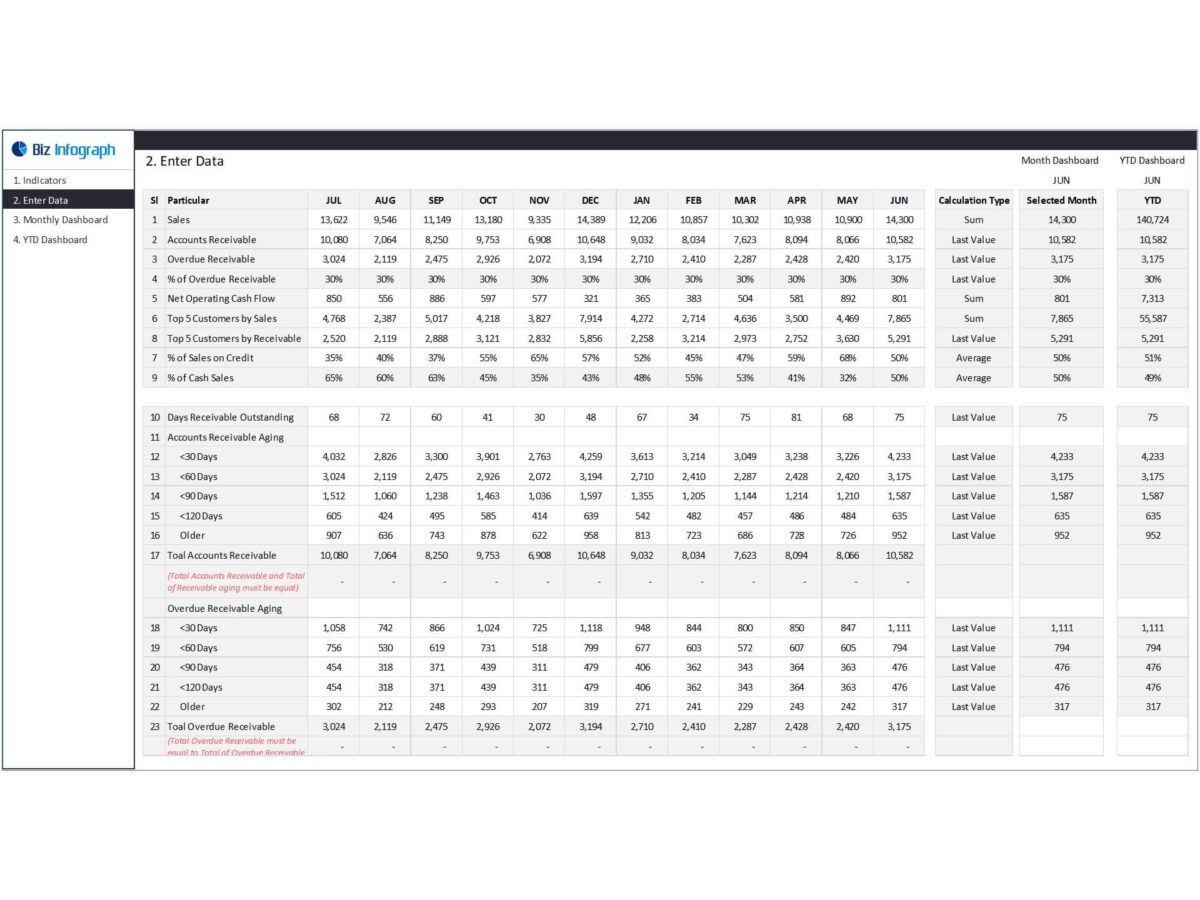
Dashboards are an incredibly useful tool. A dashboard is a comprehensive KPI snapshot that helps you view your business’s financial progress at a single glance. However, without the proper preparation, you may end up complicating the dashboard and make simple facts hard to read.
Here are some common dashboard downfalls:
Too many KPIs
When there are too many KPIs to look after, it often becomes hard to keep track of things. This is why it’s not a good practice to define a large number of KPIs in a single dashboard. Make sure your KPIs are actionable, practical, and realistic. Let’s say you’re a non-profit organization that majorly relies on donations. Your KPIs should solely rely on metrics related to the donations and not how much the business owner is spending on groceries. Before creating a dashboard, think of the kind of story you want to tell. Your dashboard needs to be in line with your business story and what narrative you’re trying to build with your information.
Implementing it too early
It’s understandable how business owners often get too excited about dashboards. However, there is no point in implementing a dashboard if it hasn’t been adequately drafted. Make sure your dashboard doesn’t tell an inconsistent or incomplete story. This will eventually confuse your dashboard viewers. It’s your job to make sure that your viewers are able to understand the dashboard without asking any questions. The dashboard’s job is to make their workload a lot easier, not add to it. Try and make your dashboard as usable as you can.
At the same time, it’s also essential that you’re testing the dashboard adequately. Run as many tests as you can. The more errors you pinpoint early on, the fewer glitches the dashboard will encounter later on. It also helps to chalk out an extensive training plan when you’re introducing the dashboard. Take your time in doing your research.
Combining all possible information sources.
Most businesses rely on a number of tools and systems to house essential information. These include accounting software such as QuickBooks, scheduling software, ERP, CRM, marketing automation, and EHR. A dashboard presents a single-glance view of all of your business information. Even though a dashboard’s primary job is to combine information from all of these sources into a single view, it doesn’t mean you should always combine them.
When you’re storyboarding the dashboard, make sure you’ve kept the company’s financial objectives in mind. Always filter out the databases that are important, so you don’t end up overwhelming the dashboard. However, you can still connect the databases if not include all of them. Try and connect the individual dashboards using hyperlinks and drill-down menus.
Creating a dashboard is often like putting together IKEA furniture—challenging ad fun at the same time. To make things easier for you and your business, Biz Infograph offers a number of well-designed and eye-catching financial dashboard templates for your business to use. All you need to do is plug in your data, and you’ll have all the insights right in front of you.
