Introduction to Budget vs Actual Dashboards
What is a Budget vs Actual Dashboard?
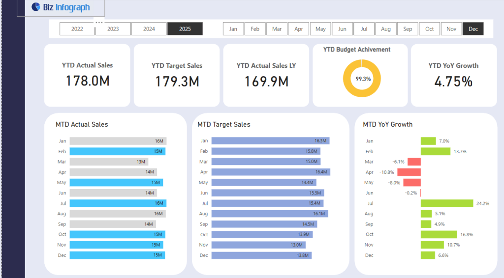
A budget vs actual dashboard is a business intelligence tool that compares planned financial expectations (budget data) with actual results. In the context of sales, a Sales Budget vs Actual Dashboard displays actual sales figures alongside budgeted figures, helping businesses make informed decisions by highlighting gaps between forecasts and reality. These dashboards are commonly built in Power BI, where visual elements such as graphs, tables, and KPIs allow users to easily spot differences. A well-designed dashboard using Power BI ensures that finance and sales teams have a comprehensive view of performance and can adjust strategies accordingly.
Importance of Tracking Sales Budget vs Actual Performance
Tracking sales performance by comparing actual outcomes with budgets is essential for effective planning and forecasting. A power bi budget vs actual dashboard helps identify over- and under-performance at various levels—team, product, region, or quarter. By comparing actual sales to budgeted figures, companies can understand deviations and adjust sales targets and marketing strategies. With features like real-time updates and mobile accessibility, these dashboards provide actionable insights when and where they are needed most. Accurate tracking supports agile decision-making, helping organizations optimize resources, forecast revenue more accurately, and ultimately improve financial performance.
Key Features of a Budget vs Actual Dashboard
A modern budget vs actual dashboard in Power BI includes features such as:
- Real-time data syncing from data sources like Excel, Azure, or SQL.
- Visual breakdowns of sales amount, budgeted figures, and actual revenue using bar and line charts.
- Performance metrics and KPIs for quick assessment.
- Filters for quarterly, monthly, or regional comparisons.
- A mobile-friendly layout for on-the-go updates.
- Integration with DAX to calculate the difference between budget and actuals dynamically.
These dashboard features enable sales and finance teams to interact with this Power BI dashboard effectively and with purpose.
Core Components of a Sales Budget vs Actual Dashboard
Budget, Actuals, and Variance Metrics
The foundation of any sales budget vs actual dashboard lies in tracking budgeted figures, actual sales, and variance. Variance represents the difference between what was expected and what was achieved and can be shown in both absolute value and percentage terms. Using DAX, Power BI users can calculate the budget, actuals, and calculate the difference for real-time tracking. A typical dashboard template will include variance bars or conditional color-coding to easily identify areas that are over or under budget. These key metrics give leadership a clear understanding of business performance and promote data-driven strategies.
Visualizing Trends Over Time with Charts and Key Metrics
Effective visualization is crucial in a dashboard using Power BI. With time-based visuals like line charts or clustered column graphs, users can observe trends over time—for instance, how sales amount and budgeted figures changed quarter to quarter. This allows the dashboard to identify trends, seasonality, or unexpected shifts. By including key metrics like variance percentage and year-to-date performance, sales managers can monitor success and make proactive changes. These visuals make the data accessible and easy to interpret, even for non-technical users, making it one of the most effective types of Power BI dashboard templates.
Forecasting and Variance Analysis Techniques
Incorporating forecast logic and variance analysis helps businesses prepare for the future. Power BI enables the use of DAX formulas and Power Query to perform historical trend analyses and predict actual revenue outcomes. This enhances financial planning by showing not just current deviations, but potential future variances. Using efficient data modeling and structured fact tables within a star schema, dashboards can analyze performance with high granularity—whether it’s month-to-date, quarter-to-date, or year-to-date. A Power BI budget vs actual report is only as good as its ability to help users look ahead, and this component ensures they do just that.
Building a Budget vs Actual Dashboard in Power BI
Using DAX for Budget and Actual Calculations
DAX (Data Analysis Expressions) is essential for creating calculated columns and measures that power your Power BI report. With DAX, users can define measures for actuals, budget, and variance using formulas like:
DAX
CopyEdit
Variance = [Actual Sales] - [Budget Sales] Variance % = DIVIDE([Variance], [Budget Sales], 0)
These calculations allow for dynamic updates and meaningful KPIs. The ability to calculate and visualize differences using DAX makes Power BI far more flexible than tools like Excel. This flexibility is key in turning static financial data into a dynamic, data-driven dashboard experience.
Power Query and Data Integration from Excel and Azure
The Power Query Editor is the starting point for data cleansing and transformation. Users can connect to multiple data sources like Excel, Azure, or SQL databases, clean inconsistent data, and build a consistent data model. By integrating budget tables, actual transactions, and sales data, Power BI provides a reliable foundation for accurate reporting. Data refreshes can be scheduled in the Microsoft Power BI service to keep your dashboards updated with the current date values. The end result is a unified model that can be used to fuel analytics and decision-making across your sales and finance teams.
Designing an Interactive Dashboard Template in Power BI
An interactive Power BI dashboard template should balance information density with clarity. The layout might feature tabs for overview, quarterly views, and detail breakdowns by department or region. Using visuals like matrix tables, bar charts, and KPI cards, the dashboard displays comparisons clearly and engagingly. Slicers, drop-downs, and tooltips enhance user experience, allowing them to interact with this Power BI report based on their needs. Export options, mobile view allows, and shared access via Power BI service all contribute to seamless collaboration and cross-functional visibility. Templates can be reused across projects or customized using pbix files for scalable analytics.
Best Practices and Use Cases
Dashboard Examples for Sales Budgeting and Forecasting
A great dashboard example includes visual KPIs, budget vs actual tables, and variance trend graphs. For example, a sales budget vs actual dashboard may show top-performing products, underperforming regions, and monthly deviations from targets. These dashboards are especially useful for forecasting by combining historical sales trends and predictive modeling techniques. Many organizations download free templates or build their own using Power BI dashboard templates, adapting the visuals and metrics to their business needs. Examples often include export-friendly formats for presenting results to stakeholders, helping teams align on sales goals and budgeting strategy.
Quarterly Analysis and Key Decision-Making Insights
Breaking down the budget vs actual analysis by quarterly periods gives leadership insight into seasonal trends and campaign impact. A Q1 analysis might reveal missed targets due to delayed product launches, while Q3 might show over-performance due to promotional pushes. These insights can be easily drawn using slicers and bookmarks in Power BI. By comparing actual vs budget across time frames, companies can better allocate resources and prioritize high-impact activities. This quarterly lens provides the strategic depth that daily or monthly dashboards might miss, helping teams pivot quickly and plan future quarters more effectively.
Benefits of Using Power BI over Traditional Excel Dashboards
While Excel is familiar and accessible, it lacks the automation, scalability, and advanced modeling capabilities of Power BI. Unlike static spreadsheets, a Power BI budget vs actual dashboard provides dynamic interactivity, real-time updates, and user-specific views. It integrates directly with Azure, SQL, and other platforms, reducing manual data entry and improving accuracy. Users can build a connected data model, apply variance analysis, and optimize sales performance across the board. With Power BI, data isn’t just reported—it’s explored, transformed, and used to create value. These benefits make Power BI the modern standard for budget vs actual dashboards.
For ready-to-use Dashboard Templates: