Understanding Budget Variance Dashboards
What is a Budget Variance Dashboard?
A budget variance dashboard is a financial reporting tool used to monitor and visualize the difference between budgeted and actual financial performance. This type of dashboard compares planned budget values to actual figures such as revenue, expenses, and cost of goods sold. A budget vs actual dashboard offers a real-time view of financial data, helping teams quickly identify whether a variance is favorable or unfavorable. Variance occurs when the actual outcome deviates from the expected result. By using this type of dashboard in an Excel dashboard or Power BI format, companies can better understand how well the organization is able to align with its budget.
Importance of Budget Variance Analysis in Financial Analysis
Budget variance analysis is the process of comparing budgeted figures to actual results and determining the causes behind deviations. This analysis plays a crucial role in financial analysis by helping identify areas where the company is performing above or below expectations. A positive variance (where actual revenue is higher than expected or costs are lower) is a good sign, while a negative variance may indicate rising actual expenses or a decrease in sales. Effective budget variance analysis can help leadership make more informed decisions and take corrective actions to manage operational costs and boost profitability. It also contributes to better budget forecasting and resource planning.
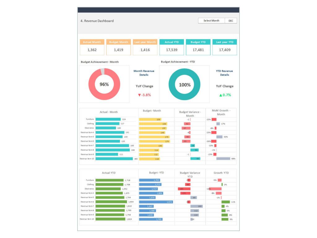
Budget vs Actual Dashboards for Tracking Deviations
A budget vs actual dashboard is a key tool used by finance teams to track budget adherence and highlight discrepancy between actuals and budget values. With this dashboard, finance professionals can compare actual performance to planned figures, identify unfavorable variances, and determine the root cause of each difference. Whether using Excel or Power BI, a well-structured dashboard allows users to explore actual and budgeted data using filters, slicers, and charts. This enables real-time monitoring of actual financial performance, supporting informed decisions around cost control, revenue optimization, and strategic planning.
Building a Budget Variance Dashboard in Excel
Essential Components of an Excel Dashboard for Budget Tracking
An Excel dashboard for budget variance analysis typically includes several key elements: input areas for budgeted amounts, columns for actual amounts, automatic variance calculations, and visual indicators like color-coded charts or graphs. You’ll often see percentage variance to reflect how much the actual figures deviate from expectations. Excel’s flexibility allows for the integration of drop-down filters for time periods, departments, or project categories. You can also integrate KPIs that are directly impacted by budget variances. These components make it easy to perform financial analysis, Cash flow, track actual costs, and spot areas for improvement. Whether you’re using a simple excel template or building from scratch, accuracy and clarity are essential.
Steps for Calculating Variances in Excel
Calculating variances in Excel involves straightforward formulas to subtract the budgeted values from the actual values. For instance, the basic formula is =Actual - Budget. To get the percentage variance, use =(Actual - Budget)/Budget, which tells you how far off the actual performance is in percentage terms. You can also highlight whether the variance is favorable or unfavorable with conditional formatting—green for positive variance, red for negative variance. Excel can also accommodate more complex variance types, such as actual variance analysis based on historical data, or segmented by project, department, or account. These tools allow finance professionals to analyze the variances more precisely and determine corrective actions.
Using Excel Templates and Drop-Downs for Dynamic Dashboards
To make your dashboard more user-friendly, consider using a customizable excel template that includes drop-down lists for selecting different time frames, business units, or categories. These dynamic features allow users to filter budgeted and actual data easily and make the dashboard interactive. A well-designed budget template will pull from multiple sources of financial statements, perform automatic calculations, and deliver updated visuals with each change. Incorporating such functionality ensures the dashboard can evolve alongside your business needs. These templates save time and provide structured layouts that are useful for financial management, especially when tasked with creating reports for stakeholders or leadership teams.
Data Visualization and Dashboard Design
Effective Data Visualization Techniques for Variance Analysis
Strong data visualization is essential for communicating the story behind the numbers. Charts, graphs, and color indicators simplify complex financial data, allowing decision-makers to instantly assess performance. Bar charts comparing actual and budgeted figures, line graphs showing trends over time, and heatmaps displaying variance severity are all helpful formats. In Excel, you can use Sparkline charts, conditional formatting, and Pivot Charts for interactive visuals. A well-built budget variance dashboard translates numeric data into meaningful insights, helping businesses stay agile and responsive.
Excel vs Power BI for Budget Variance Dashboards
While Excel is ideal for building a customizable budget variance dashboard, Power BI offers advanced BI capabilities for larger-scale, automated dashboards. Power BI enables real-time integration with accounting software, automated data refreshes, and detailed drill-down features. It’s especially useful for tracking variances across multiple departments or regions using live dashboards. On the other hand, Excel remains the go-to tool for hands-on control, faster prototyping, and calculating variances in Excel spreadsheet with built-in formulas. Excel is best suited for small to mid-sized organizations or ad-hoc budget variance analysis, while Power BI is better for scalable, enterprise-grade financial analysis dashboards with more sophisticated data management capabilities.
Best Practices for Designing a Budget Variance Dashboard
When designing a budget variance dashboard, follow key best practices to ensure accuracy and usability. First, organize your data clearly—keep your budgeted figures, actual results, and variance calculations in separate but linked sections. Use consistent labels and ensure all formulas are error-proof. Incorporate color-coded visuals to indicate positive or negative variances. Always display budget vs actuals comparisons prominently and include options to investigate the root cause of discrepancies. Update your dashboard whenever new actual performance data is available. Lastly, test your dashboard with sample data to confirm functionality. These practices ensure that your dashboard drives actionable insights and supports better financial management.
For ready-to-use Dashboard Templates: