Understanding the Bell Curve and Normal Distribution
What is a Bell Curve?
A bell curve, also known as a normal distribution, is a graphical representation of a data distribution where most data points lie around a mean value, with fewer points appearing as they move further from the mean. The shape resembles a bell, hence the name. This curve is also referred to as a Gaussian distribution and is useful for analyzing employee performance, test scores, and financial trends.
The highest point on the curve represents the mean of the data point, where most values are concentrated. A bell curve can be used to visualize how data is spread over a range, helping analysts determine if the data follows a typical distribution or if outliers exist. This method of visualizing data as a normal distribution is crucial for many statistical and business applications.
Importance of Normal Distribution
A normal distribution curve is essential for performance analysis, forecasting, and decision-making across various industries. Data as a normal distribution allows businesses to analyze trends and make predictions based on past behaviors. In employee performance, a bell curve helps categorize employees into different performance levels based on the distribution function.
This distribution is crucial in statistics because it helps in transforming raw data into meaningful insights. For instance, if salaries in a company follow a normal distribution, HR managers can use this data to create fair compensation structures. Understanding cumulative distribution helps businesses determine probabilities and make informed strategic decisions.
Key Elements: Mean and Standard Deviation
The mean of the data point is calculated using the average function in Excel, which provides a central reference for the distribution. The standard deviation using Excel measures the data’s spread around the mean. A small standard deviation means the data points are clustered around the mean, while a large standard deviation suggests a broader distribution.
To fully grasp the bell curve using Excel, one must consider the three standard deviations concept:
- 68% of data points lie within one standard deviation of the mean.
- 95% fall within two standard deviations.
- 99.7% are within three standard deviations.
Understanding these concepts helps when trying to graph normal distribution in Excel.
Preparing Data for the Bell Curve in Excel
Calculate the Mean and Standard Deviation
To create a bell curve chart, the first step is to calculate the mean and standard deviation of a given data set. In MS Excel, you can do this using built-in formulas:
- Enter your data in a column (e.g., A1:A20).
- Use the formula
=AVERAGE(A1:A20)to calculate the average (mean). - Use
=STDEV.P(A1:A20)(for population standard deviation) or=STDEV.S(A1:A20)(for sample standard deviation).
These calculations help determine the variance and spread of data. Once done, it is time to calculate the normal distribution, which will be used to graph your data.
Setting Up Data Points for the Curve
A bell curve requires a range of values around the mean. In Excel, you can create a series of values:
- Start with a minimum and maximum value based on the dataset.
- Divide the range into equal intervals (e.g., from
mean - 3*standard deviationtomean + 3*standard deviation). - Copy this formula in adjacent cells to create a smooth curve.
These data points lie along the x-axis when we create the bell curve.
Using the NORM.DIST Formula
Excel offers the NORM.DIST formula to compute normal distribution values:
excel
CopyEdit
=NORM.DIST(x, mean, standard_deviation, FALSE)
- Replace
xwith the corresponding data point. - Set
FALSEfor probability density function. - Copy this formula for all x-values.
This helps generate a normal distribution chart, which will later be used to make a bell curve.
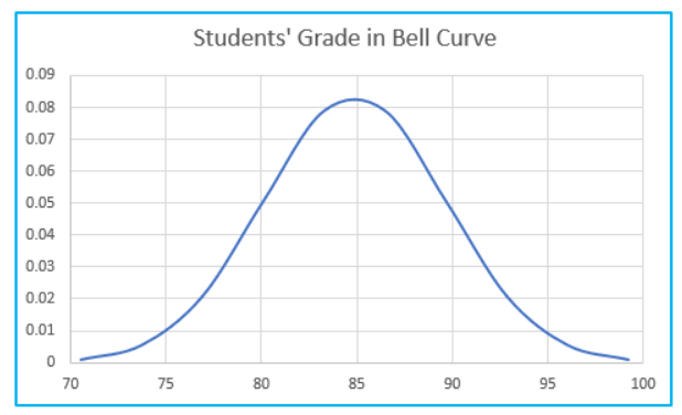
Creating a Bell Curve Chart in Excel
Generating Data Using NORM.DIST
Once the normal distribution values are calculated, they need to be visualized in a graph in Excel. The NORM.DIST values act as the y-axis, representing the probability density of each x-value.
To make the curve look smooth, ensure the data needs a sufficient number of x-values (e.g., 30-50 points).
Creating the Graph in Excel
To create the bell curve in Microsoft Excel, follow these steps:
- Select your x-values and y-values.
- Go to Insert > Scatter Chart > Insert a Scatter Chart with Smooth Lines.
- This chart will represent the normal distribution curve.
Once plotted, the chart should resemble a bell curve using Excel’s built-in tools.
Formatting the Bell Curve Chart
To enhance the visualization:
- Adjust the axis to fit the data range.
- Modify chart elements (title, labels, gridlines).
- Remove markers from the scatter plot to make the curve smooth.
Following these Excel tips will result in a clear and professional-looking bell curve chart.
Customizing and Refining the Bell Curve
Adjusting the Axis and Labels
A well-designed chart should have properly formatted data to improve readability. Ensure that:
- The x-axis spans from mean – 3 standard deviations to mean + 3 standard deviations.
- The y-axis is adjusted so that the highest point is visible.
- Axis titles should clearly describe the data being represented.
Smoothing the Curve for Better Visualization
The scatter chart should have smooth transitions between points. In Excel, you can enable smoothed line charts for a professional look.
Enhancing the Excel Chart with Excel’s Built-in Features
You can further customize the chart by:
- Changing colors and themes.
- Adding a cumulative distribution line for better insights.
- Highlighting areas under the curve (e.g., employee performance categories).
Practical Applications of the Bell Curve
Analyzing Data with the Normal Distribution Graph
The normal distribution chart helps businesses graph normal distribution in Excel for statistical analysis, such as performance analysis in HR or quality control in manufacturing.
Using the Bell Curve for Performance Evaluation
Many companies use the bell curve in Microsoft Excel to categorize employees into low, average, and high performance groups.
Making Data-Driven Decisions
A normal distribution curve is useful in risk analysis, predicting trends, and optimizing processes.
Excel Tips and Best Practices
Common Mistakes to Avoid
- Using too few data points, which results in an inaccurate curve.
- Forgetting to set FALSE in the NORM.DIST formula for probability density function.
- Incorrect variance calculation leading to skewed results.
Advanced Excel Functions for Statistical Analysis
Besides NORM.DIST, Excel has other statistical tools such as:
- NORM.INV (inverse normal distribution)
- CONFIDENCE.NORM (confidence intervals)
Automating the Bell Curve with Excel Formulas
For advanced users, macros or Power Query can automate the bell curve generation, making it simple to create and analyze multiple datasets quickly.
For ready-to-use Dashboard Templates: