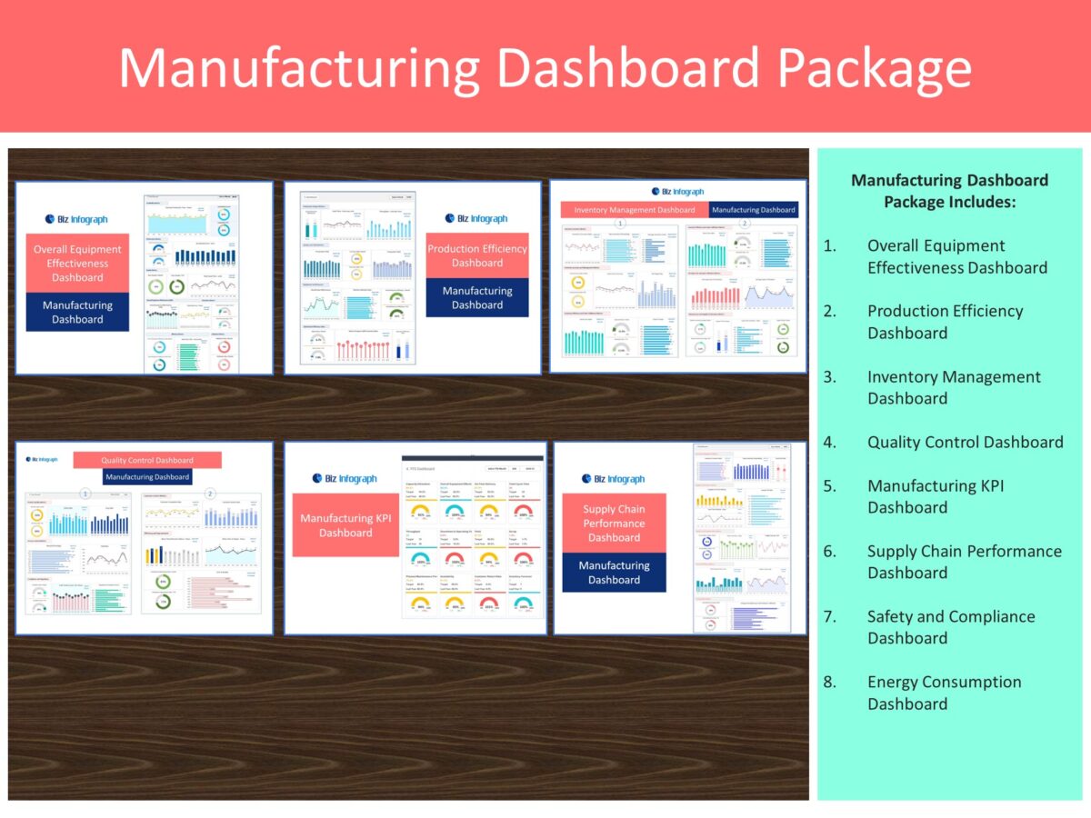
Manufacturing Dashboard is pivotal in the fast-paced world of manufacturing, where decision-makers require clear and actionable insights to maintain a competitive edge. Manufacturing dashboards transform raw data into understandable, visually engaging, and real-time insights, serving as crucial tools for streamlining processes and identifying areas for improvement. They foster a culture of continuous enhancement by leveraging the right combination of visualizations and key performance metrics, enabling manufacturing leaders to make informed decisions swiftly and maintain peak productivity and efficiency.
Examples of Manufacturing Dashboards
1. Overall Equipment Effectiveness (OEE) Dashboard – Manufacturing Dashboard
Explanation of OEE and its Components
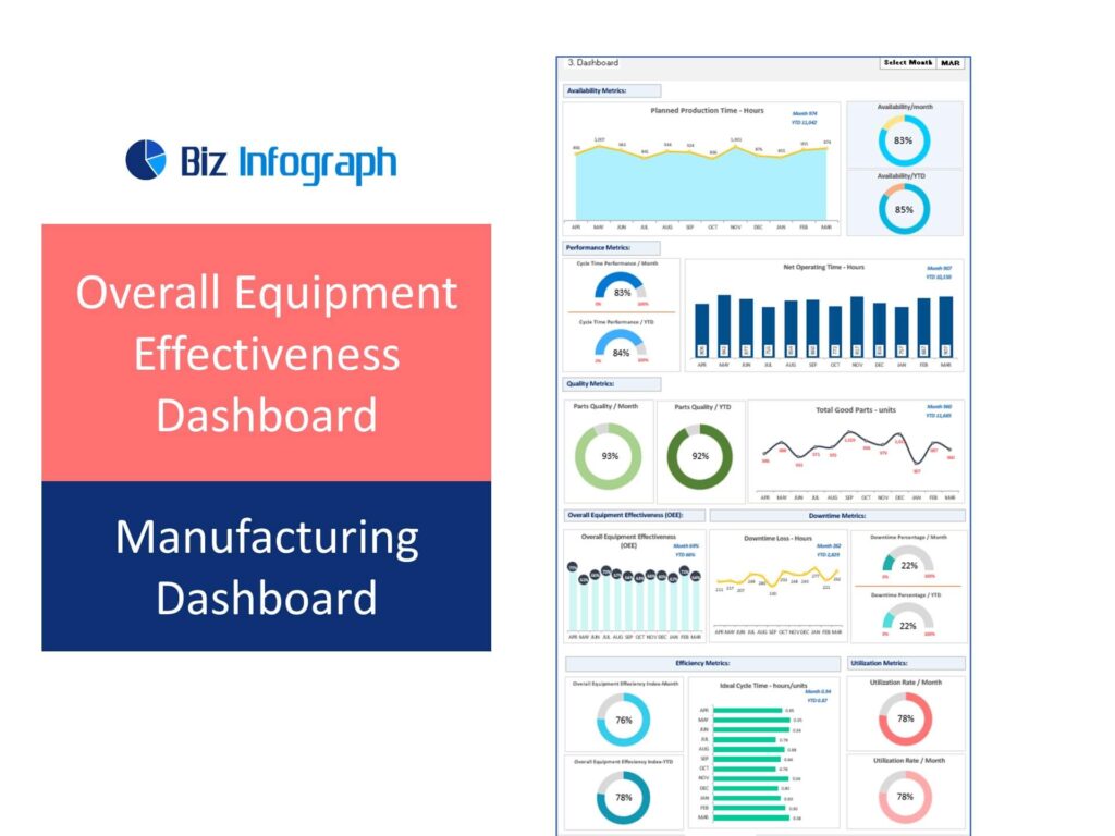
Overall Equipment Effectiveness Dashboard is a comprehensive metric used to gauge the effectiveness of a manufacturing unit. It is the gold standard for measuring manufacturing productivity, combining three essential components into a single metric:
-
- Availability – Reflects the percentage of scheduled time that the equipment is available to operate. It takes into account downtime due to breakdowns, adjustments, or planned maintenance.
-
- Performance – Assesses whether the manufacturing process is running as fast as possible, considering factors like speed loss due to suboptimal performance.
-
- Quality – Measures the proportion of quality products against the total output, factoring in products that meet quality standards without the need for rework.
Key Metrics to Track Manufacturing Data
To fully harness the power of the OEE dashboard, it’s crucial to monitor specific metrics that feed into each component of OEE:
-
- Downtime – Tracks the time when equipment is not in operation, highlighting opportunities for improving availability.
-
- Speed Loss – Monitors performance dips below the ideal machine speed, pointing out inefficiencies in the process.
-
- Quality Rate – Measures the rate of production that meets quality standards, illuminating areas for quality improvement.
Visualization Examples
Effective visualizations translate data into actionable insights:
-
- Bar Charts – These charts show net operating hours, overall equipment effectiveness percentages, ideal cycle time – hours/unit etc.
-
- Line Graphs for Trend Analysis – Trend lines for OEE and its individual components over time provide a dynamic view of planned production time, downtime loss hours, total goods parts – units etc.
2. Production Efficiency Dashboard – Production Dashboard
Importance of Monitoring Production Efficiency Analytics
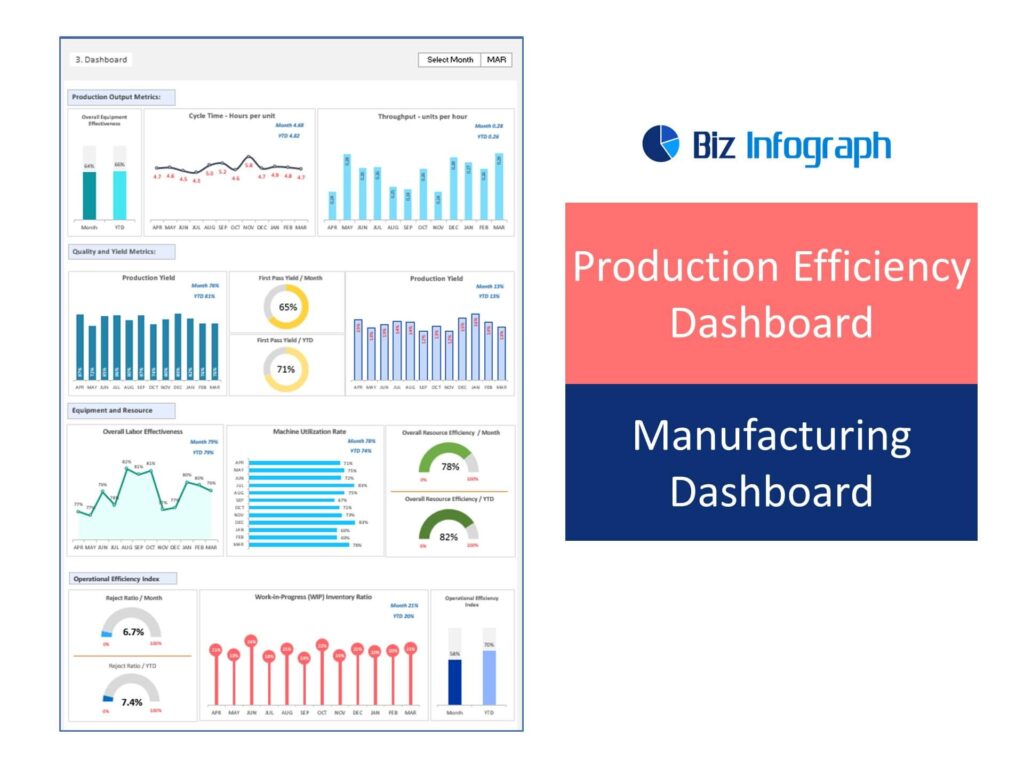
Monitoring production efficiency is paramount for optimizing operations in a manufacturing operation. A production efficiency dashboard provides a real-time snapshot of how effectively the manufacturing process converts raw materials into finished goods. The dashboard helps in identifying inefficiencies in the production line, minimizing factory waste, and ensuring that every aspect of the production process is operating at its optimal capacity. By keeping a constant eye on production metrics, manufacturers can make immediate adjustments, leading to cost savings, improved product quality, and faster delivery times.
Key Metrics to Track Production
To maximize the utility of an efficiency dashboard, focus on these key production KPIs:
-
- Cycle Time – Measures the total time taken to complete a production process from start to finish. Monitoring cycle time helps in identifying bottlenecks and streamlining the process.
-
- Throughput – Refers to the amount of product produced over a specific period. Tracking throughput is essential for understanding production capacity and planning for scale.
-
- Capacity Utilization – Indicates the percentage of the total manufacturing capacity that is currently being utilized. It’s critical for ensuring that resources are being used efficiently without overburdening the machinery.
Visualization Examples – Dashboard Design
-
- Half-circle pie chart for Overall Resource Utilization– The half circle pie chart for Overall Resource Utilization effectively visualizes the proportion of resources used versus those available, offering a clear and concise representation of resource allocation.
-
- Column Graphs for Throughput Over Time – Column Graphs for Throughput Over Time provide a straightforward way to track and compare the quantity of work or products produced over specific intervals, highlighting trends and fluctuations in output efficiency.
3. Inventory Management Dashboard Template
Role of Inventory Management
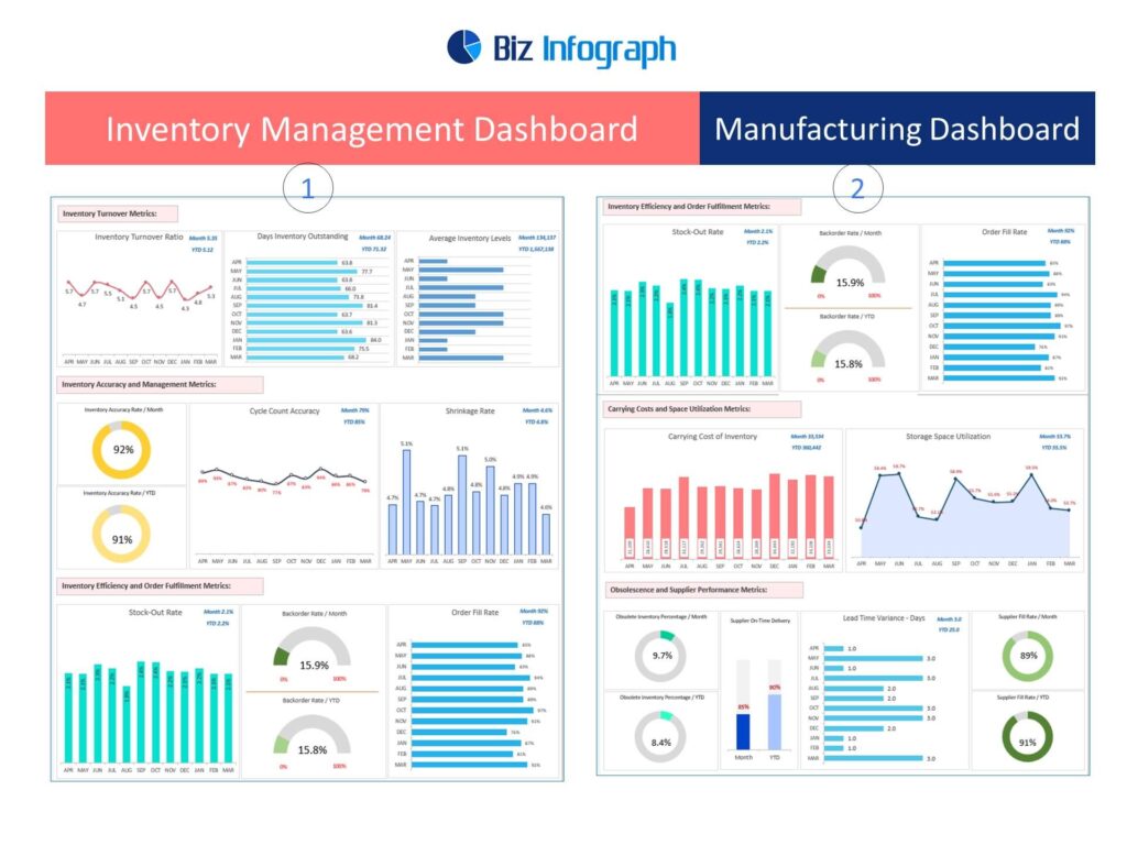
Effective inventory management is crucial for minimizing waste and ensuring that the right products are available at the right time. An inventory management dashboard offers a comprehensive view of stock levels, providing insights into inventory turnover and order status. This visibility is essential for maintaining a balance between too much and too little inventory, avoiding unnecessary storage costs, and ensuring customer satisfaction with timely product availability.
Key Metrics to Track
For a robust inventory management dashboard, these metrics are essential:
-
- Stock Levels – Provides real-time information about the quantity of each product in stock, helping to prevent stockouts or overstock situations.
-
- Turnover Rate – Indicates how often inventory is sold and replaced over a certain period. A high turnover rate may suggest strong sales or ineffective buying.
-
- Order Status – Tracks the progress of customer orders from placement to delivery, ensuring that the fulfillment process is efficient and transparent.
Visualization Examples
Engaging visualizations make inventory data easy to understand and act upon:
-
- Line chart to visualize Inventory Turnover Metrics offers a clear view of how inventory levels change over time, helping businesses identify patterns and trends in their inventory management and sales efficiency.
-
- Area chart to visualize Storage Space Utilization is effective in showcasing the extent of storage space used over a period, allowing for easy comparison of occupied versus available space, and highlighting changes in storage needs.
4. Quality Control Dashboard – Manufacturing Dashboard Example
Significance of Production Quality Control
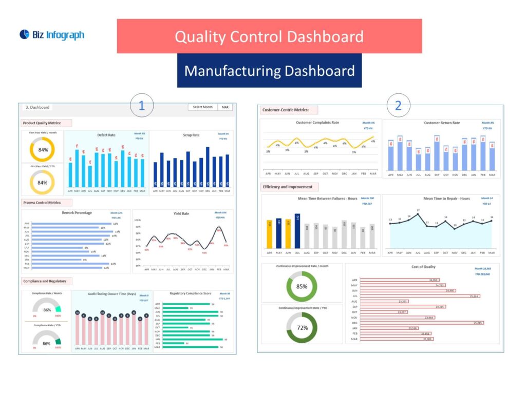
Quality control is integral to maintaining high product standards and achieving customer satisfaction. It involves systematically monitoring and evaluating various aspects of the production process to ensure that the final product meets the established standards. A quality control dashboard provides a visual representation of quality metrics, helping teams to identify issues promptly, reduce defects, and maintain consistency in product quality. This proactive approach not only safeguards the brand’s reputation but also minimizes costs associated with returns and rework.
Key Metrics to Track in Quality Dashboard
Critical metrics for a quality control dashboard include:
-
- Defect Rate – Measures the frequency of defects in the production process, offering insights into the quality of manufacturing.
-
- First Pass Yield (FPY) – Represents the percentage of products that meet quality standards without requiring rework, indicating the effectiveness of the production process.
-
- Return Rate – Tracks the percentage of products returned by customers, providing insights into customer satisfaction and potential quality issues.
Visualization Examples
Effective visualizations for a quality control dashboard are:
-
- Column Charts for Defect Rate provide an intuitive visual representation of the frequency or number of defects over a given period, making it easier to identify periods of higher defect occurrence and assess quality control measures.
- A Line chart for Customer Complaint Rate is ideal for tracking the frequency of customer complaints over time, enabling businesses to observe trends, seasonal variations, or the impact of changes in service or product quality.
5. Manufacturing KPI Dashboard
Overview of Critical Key Performance Indicators in Manufacturing
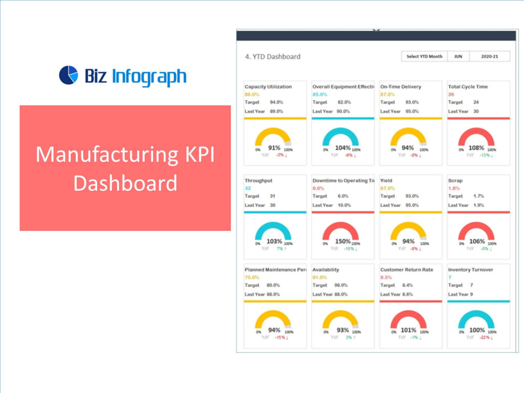
In the competitive landscape of manufacturing, Key Performance Indicators (KPIs) are vital for assessing, managing, and improving performance. A manufacturing KPI dashboard provides a clear view of the operation’s effectiveness and efficiency. By tracking the right manufacturing KPIs, manufacturers can make data-driven decisions, optimize operations, and align their production goals with their business objectives.
Key Metrics to Track
Essential KPIs for a manufacturing dashboard include:
-
- Cost of Goods Manufactured (COGM) – Represents the total production cost of goods that are ready for sale, including materials, labor, and overhead costs.
-
- Gross Margin – Measures the difference between revenue and COGM, indicating the profitability of the manufacturing process.
-
- Employee Productivity – Assesses the output per employee or per hour worked, highlighting the efficiency of the workforce.
-
- Production Volume – Tracks the quantity of goods manufactured within specific timeframe
Visualization Examples
Half-circle pie charts are an effective visual tool for displaying KPI achievement, offering a clear and concise representation of progress towards key performance indicators by comparing the achieved value against the target, thus providing a quick snapshot of performance success or areas needing improvement.
6. Supply Chain Performance Dashboard
Importance of Supply Chain Visibility
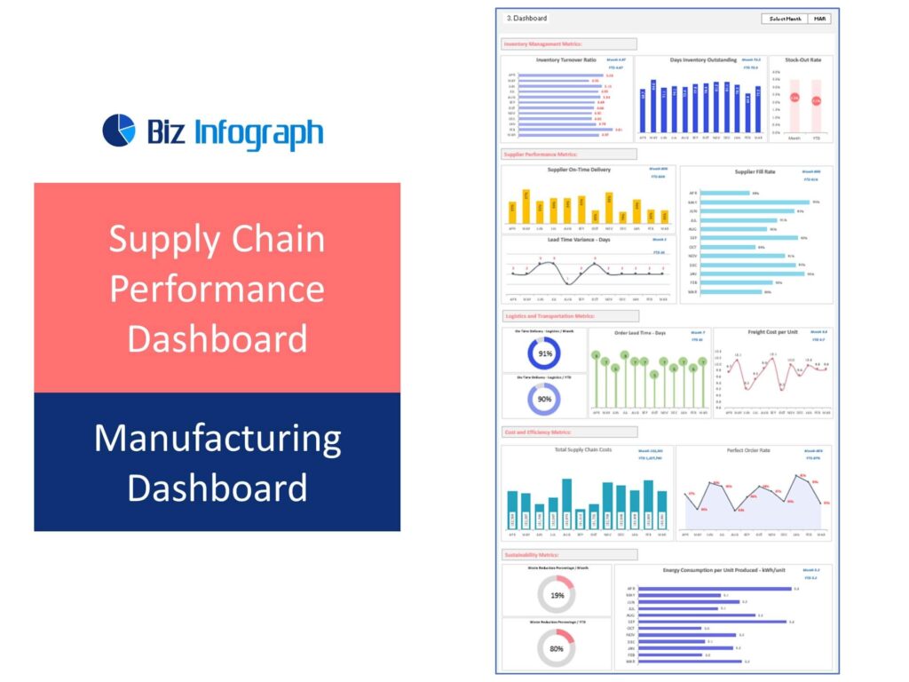
Having visibility into the supply chain is crucial for ensuring timely production and delivery of products. A supply chain performance dashboard provides an integrated view of the supply chain operations, helping businesses to anticipate and mitigate disruptions, optimize inventory levels, and maintain strong relationships with suppliers. By monitoring the right metrics, companies can enhance their supply chain resilience, reduce costs, and ensure customer satisfaction through on-time deliveries.
Key Metrics to Track
Essential metrics for a supply chain performance dashboard include:
-
- Supplier Lead Time – Measures the time taken by suppliers to deliver goods after an order is placed. Monitoring this helps in managing production schedules more effectively.
-
- Inventory Days of Supply – Indicates the number of days the current inventory will last. It’s crucial for maintaining the right balance of stock – not too much to increase holding costs, and not too little to cause stockouts.
-
- Fill Rate – Measures the percentage of customer orders fulfilled from stock on hand. It’s a critical indicator of how well a company is meeting customer demand.
Visualization Examples
Visual tools that effectively represent supply chain metrics are:
-
- A Bar chart to show the Supplier Fill Rate percentage offers a straightforward visual comparison of how well each supplier meets order demands, with bars representing the percentage of orders successfully filled by each supplier, making it easy to identify which suppliers are most reliable.
-
- A Bubble chart to visualize Order Lead Time – Days combines the size of bubbles to represent the volume of orders, with the placement of bubbles indicating the number of days taken to fulfill each order, providing an insightful view into the efficiency of order processing and potential delays.
7. Safety and Compliance Dashboard
The Critical Role of Safety and Compliance
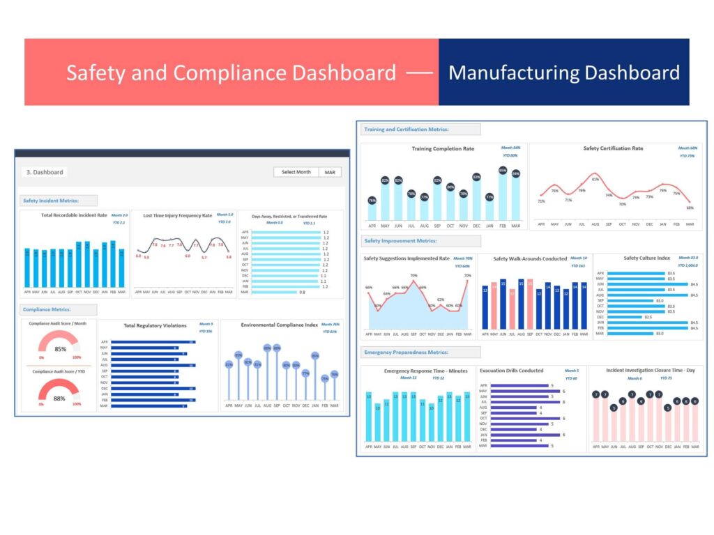
Safety and compliance are fundamental for maintaining a productive and reputable work environment. A safety and compliance dashboard is a powerful tool for monitoring the well-being of employees, ensuring adherence to manufacturing industry regulations, and maintaining operational continuity. By keeping track of safety metrics and compliance statuses, organizations can foster a culture of safety, minimize risks, and avoid costly legal issues or penalties.
Key Metrics to Track
Key metrics for a safety and compliance dashboard include:
-
- Incident Rate – Measures the frequency of accidents or incidents within a given time frame. Tracking this helps in understanding safety trends and implementing preventive measures.
-
- Compliance Rate – Indicates the percentage of operations or processes that meet regulatory and internal standards. It’s crucial for maintaining operational legitimacy and avoiding fines.
-
- Training Completion – Tracks the progress and completion rates of mandatory safety and compliance training programs among employees, ensuring that the workforce is informed and skilled in maintaining workplace safety.
Visualization Examples
Effective visualizations for a safety and compliance dashboard are:
-
- Column chart for Incident Rates Over Time effectively displays the frequency or number of incidents (such as accidents or safety breaches) occurring within a given timeframe, allowing for easy observation of trends, patterns, or the impact of safety measures over time.
-
- Line chart for Safety Certification Rate percentage is ideal for tracking the percentage of employees or departments that have completed safety certifications, illustrating progress and compliance trends over time, and highlighting areas where certification rates may need improvement.
8. Energy Consumption Dashboard
Impact of Energy Management
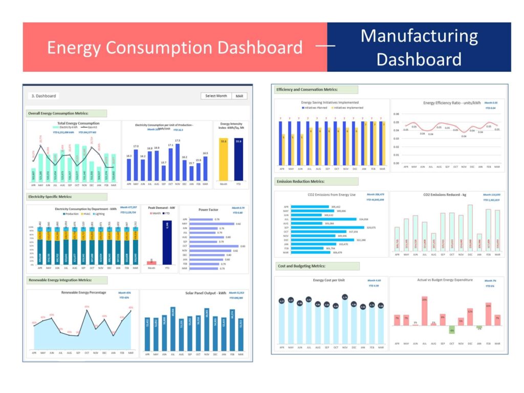
Effective energy management is crucial for reducing operational costs and promoting sustainability in manufacturing. An energy consumption dashboard provides a clear view of energy usage patterns, helping businesses to identify areas where energy is being wasted and to implement more efficient practices. By monitoring energy consumption meticulously, manufacturers can not only cut costs but also reduce their environmental footprint, aligning with global sustainability goals and improving their market standing as eco-friendly organizations.
Key Metrics to Track
Critical metrics for an energy consumption dashboard include:
-
- Energy Use Intensity (EUI) – Measures the energy used per square foot of space. It’s a key indicator of how efficiently a facility uses energy.
-
- Cost per Unit of Production – Calculates the energy cost associated with producing a single unit. Monitoring this helps in understanding the energy cost implications on the overall product cost.
-
- Carbon Footprint – Represents the total amount of greenhouse gases produced, directly and indirectly, by operations. It’s crucial for assessing environmental impact and for sustainability reporting.
Visualization Examples
Visual tools that effectively represent energy metrics are:
-
- Combo charts to show energy consumption effectively combine various types of data representations, like bar and line charts, to compare and contrast different forms of energy usage (such as solar, wind, and fossil fuels) within the same graphical view, providing a comprehensive overview of overall energy consumption patterns.
- Stacked charts to show electricity consumption by department use layered bars or areas to represent the proportion of total electricity usage attributed to each department within an organization, offering a clear visual breakdown of which departments are consuming more or less electricity, aiding in energy management and efficiency analysis.
Conclusion
This comprehensive overview of eight innovative manufacturing dashboards highlights the significance of harnessing data for operational excellence. Each dashboard offers unique insights that drive performance, from enhancing equipment effectiveness and production efficiency to ensuring quality control and optimizing supply chain operations. Additionally, focusing on safety, compliance, and sustainability through energy consumption analysis ensures a holistic approach to manufacturing excellence.
To help businesses embark on their data-driven decision-making journey, Biz Infograph offers a range of professionally designed dashboards to simplify the data analysis process. From the best Excel dashboard templates to help companies visualize data to Executive Dashboards that businesses can utilize offer top-level leaders a comprehensive overview of the company’s performance, integrating critical metrics and data from various departments to aid in strategic decision-making and long-term planning.
Get in touch with us to use financial dashboard templates and make the right data-driven decisions!
