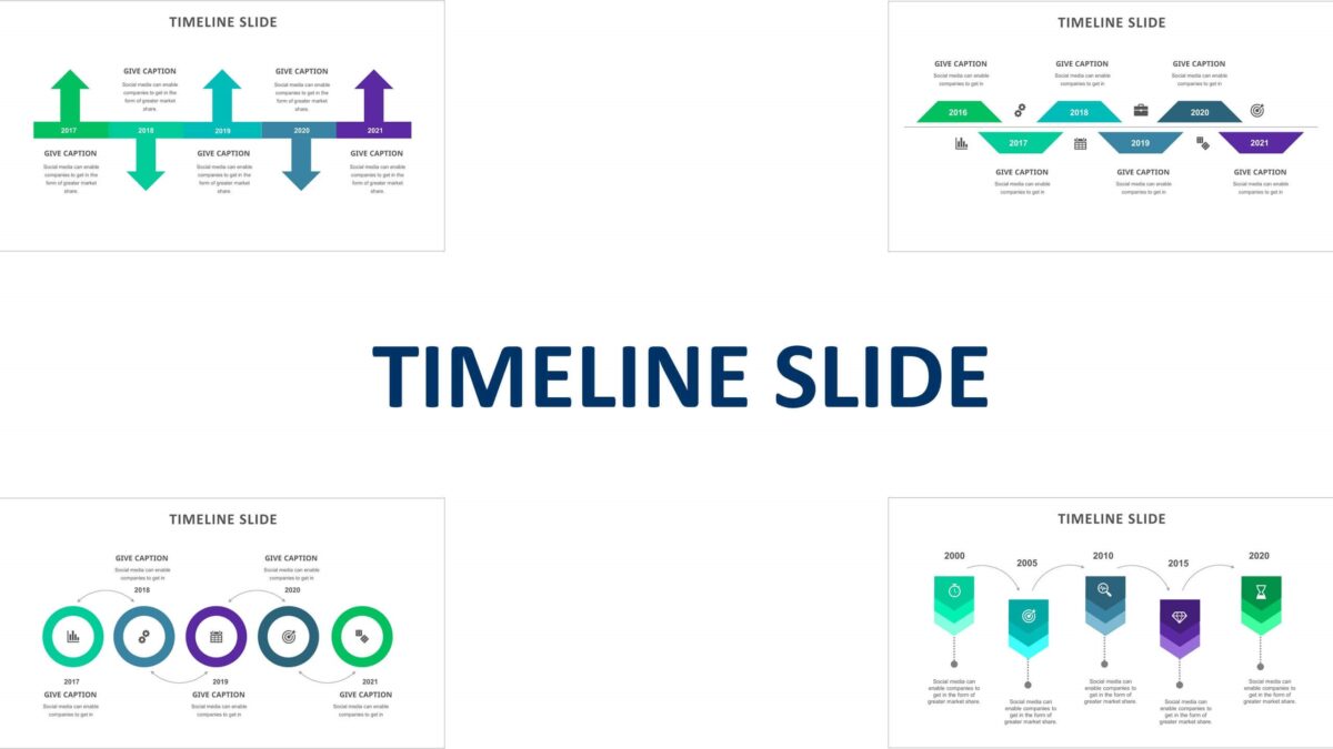
A presentation can be a hit and miss if you don’t have the right PowerPoint presentation to support you. You will see many different types of presentations; some use many pictures, while others might use a lot of text; using both of these extensively can be bad for your presentation. There are many ways you can make effective PowerPoint presentations, but you need to avoid the following things first.
Long and Extensive Test
Perhaps one of the most common mistakes you’ll see in most presentations is that they would be filled with long paragraphs and descriptions. There can be a couple of reasons for that: the presenter wanted to deliver as much information as possible or read the information during the presentation. This leads to no space for any infographic slides or pictures, making the presentation dull and unengaging.
Furthermore, too much text also affects your presentation as well, as most of the audience would prefer to read the text rather than listen to you. The best way to utilize text is to present statistics, key points, or just headings. This allows you to cover all the topics while also encouraging the audience to listen to you.
Unreadable Font
Combine too much text with an unreadable font, and you have a recipe for disaster. Most people think that using a different font can make their presentation stand out. In reality, it’s quite the contrary, as fancy fonts can become hard to read, and people sitting away from the screen will have trouble reading the text. This makes them lose interest even if you’re telling something useful. Some of the most common and easy-to-read fonts include Times New Roman, Calibri, and Arial. Plus, many major citation standards also have set the rule of using these fonts.
Bad Image or Video Quality
Another problem that people don’t seem to understand is that the quality of images may look ok on their laptop or computer but would go bad on a larger screen due to the resolution. Furthermore, some people even choose to use images that are completely unrelated to the presentation topic, distracting the audience. You must also use some text with images as you need people to read the text if they miss out on some information you said. Also, avoid extensive transitions as they can get very annoying and distracting after a short while.
You forget about ineffective and bad presentations if you start using our PowerPoint slide templates. We have some of the best slide templates you can find, as all of them are professionally designed. They are a mixture of creative infographics, pictures, and text so you can maximize your performance. We also provide dashboard templates for business functions like HR dashboards, sales dashboards, and financial dashboards on our website. You can also contact us for more information.
