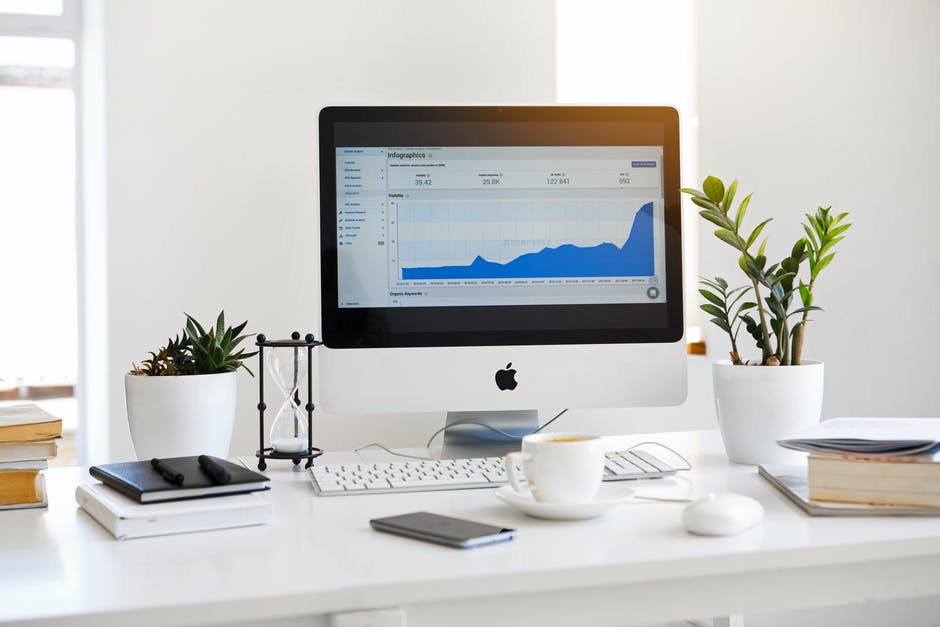
Whether they’re financial dashboards, HR dashboards, or for personal use, dashboards are a powerful organizational tool. However, it’s easy to miss out on the full extent of their potential if you’re not using them correctly.
There are certain key issues and mistakes that should be avoided when developing your own setup. Avoiding certain practices and focusing on others can be incredibly beneficial to your company—so this is what to look out for:
1. Avoid making it unnecessarily complicated
Excessive KPIs, metrics, visualizations, and too many links and overlaps with information can all complicate your dashboard unnecessarily. While the primary purpose of a dashboard is to simplify data that is otherwise complex and difficult, if you muddle too many factors and details onto it, it defeats the purpose.
Focus on keeping essentials and beneficial indicators front and center, and avoid overloading users with information from the get-go. Instead, you can choose templates with multiple sections or add multiple pages for better organization.
2. Multiple visualizations and graphs on the dashboard
Visualizations and graphs are important tools and do a great job of illustrating numbers, demographics, progressions, and other key indicators. However, too many visualizations can be overwhelming, confusing, and unnecessary. Often, standalone statistics and figures are more than enough to make a point and communicate the effectiveness of something.
Instead, pick and choose the right graphic representations and visualizations, finding the kind that’s most suited to your needs. Pie charts and bar graphs aren’t appropriate or compatible with all data types, so don’t make them your default.
3. Incomplete and insufficiently labelled data
Data without context, appropriate labeling, and explanation is useless. Stating a figure isn’t enough when there’s no indication of how you arrived there. Any type of data you use requires proper analysis, trend reports, and labeling for it to be understandable and beneficial to the viewer.
This is also applicable to the context and purpose of your dashboard. Not having a clear purpose or intention for your dashboard means it’s not helpful for users, which means you’ve put in time and effort—and money—for nothing. Defining whether your dashboard is for financial goals, employee progress, HR purposes, and setting appropriate metrics is what will help you.
Data dashboards are a powerful corporate and personal tool when used effectively. However, it’s important that you make the most effective use of dashboard and excel templates for your work. We’re bringing you some of the simplest and most well-designed dashboard templates online, as well as the best slide templates that you can purchase through our website or get for free too! Learn more about some of our dashboards here.
